


MORISAWA BIZ+ offers a lineup of UD fonts (Universal Design Fonts) at reasonable prices for users of business applications such as Word, PowerPoint, and Excel. (For details of this service, please seeHere)
This time, we will talk about font thickness, or "weight," and recommended ways to use it.
About "weight"
Sometimes you will see "Bold," "Extra Bold," or "W2" at the end of the font name. These are the "weight" types, which indicate the thickness of the font.
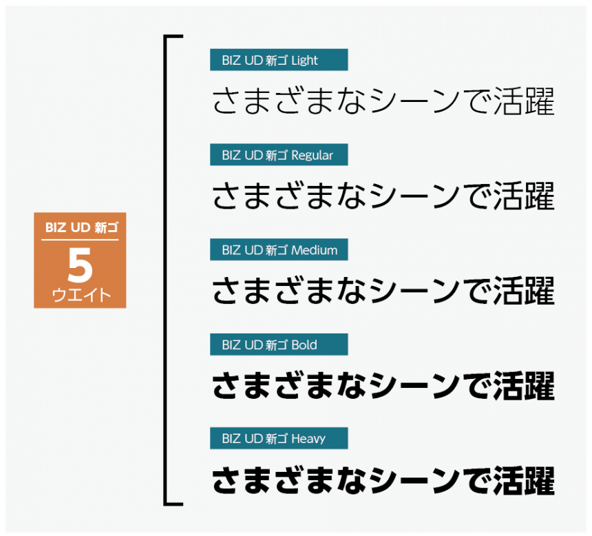
The MORISAWA BIZ+ fonts are available in five weights.*1In order of thinness, they are "Light," "Regular," "Medium," "Bold," and "Heavy."
*1 UD Digital Textbook Font includes four weights.
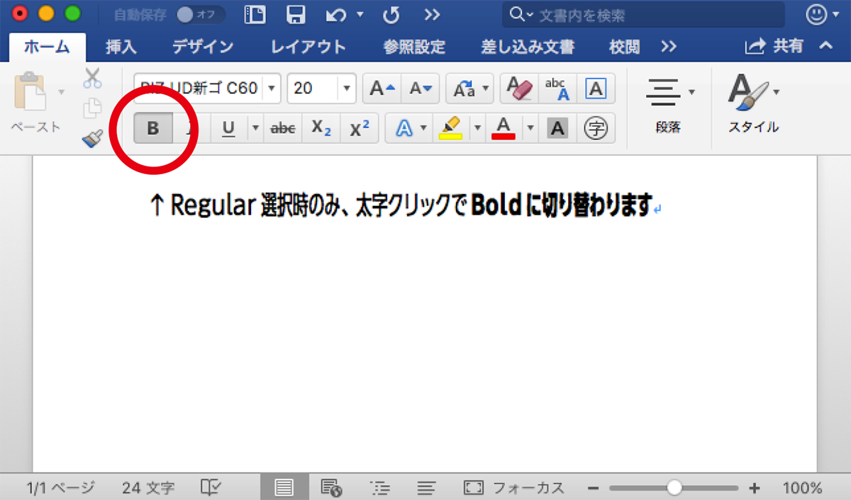
If you look at the font menu in a Windows Office application, you won't see the "Regular" and "Bold" options. The font without a weight is "Regular," and pressing the B button changes it to "Bold." Make sure to take advantage of this feature.
By the way, in Mac Office apps, the weight is displayed like this:
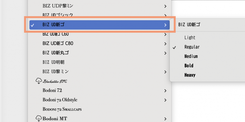
Just like Windows, Regular weights can be replaced with Bold by pressing the B button, and you can also make them bold by selecting Bold.
Whether you're using Windows or Mac, you can change the thickness of "Heavy," "Light," "Medium," and "Heavy" by selecting the font of that weight from the font menu, except for "Regular" and "Bold."
Recommended ways to use weights
In what situations are weights useful? The answer is when you are creating a document that you want to add some variety to.
This is the weight that will make your document stand out!
"Heavy" and "Bold" are headlines and titles
- Presentation slides, presentation material cover titles
- Document headings and main headings
- Important information (conclusion) from the slide or document
"Regular" is the main text
- The most readable thickness"Regular"Using this weight as a guide, you can make the weight thicker or thinner depending on the importance of the information.
"Medium" is for when you want to emphasize something in the main text.
- Medium, which is a little thicker than Regular, is useful when there is information in the text that you want to emphasize. In some cases, Bold may be more effective, so choose flexibly.
Point
You may underline text to emphasize it, but this can make it difficult to read, so if you are aiming for a more universal design, we recommend using weights.
"Light" is a caption, source, and reference
- The thinnest weight allows you to display and print even small point sizes without losing their shape. This makes it perfect for supplementary information that is not part of the main content of the document.
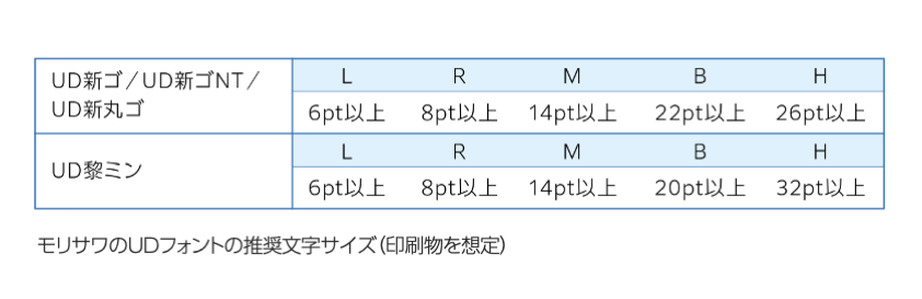
Morisawa provides minimum character sizes for each weight of UD font. Please use this as a guide when creating your materials.
What did you think?
Creating well-balanced documents is a skill that will bring you one step closer to creating documents that are easy for your boss, customers, students, and pupils to understand. By using different weights, you can create a clearer document, which will also reduce the time you would spend struggling to create a clearer document!
Please make use of weights to create well-balanced documents.
The product page for the business UD font, MORISAWA BIZ+, isHere
You can download free fonts or purchase paid fonts.Free Membership RegistrationClick the button below!