Kyoto University of Art and Design
Correspondence Course Information Design Course
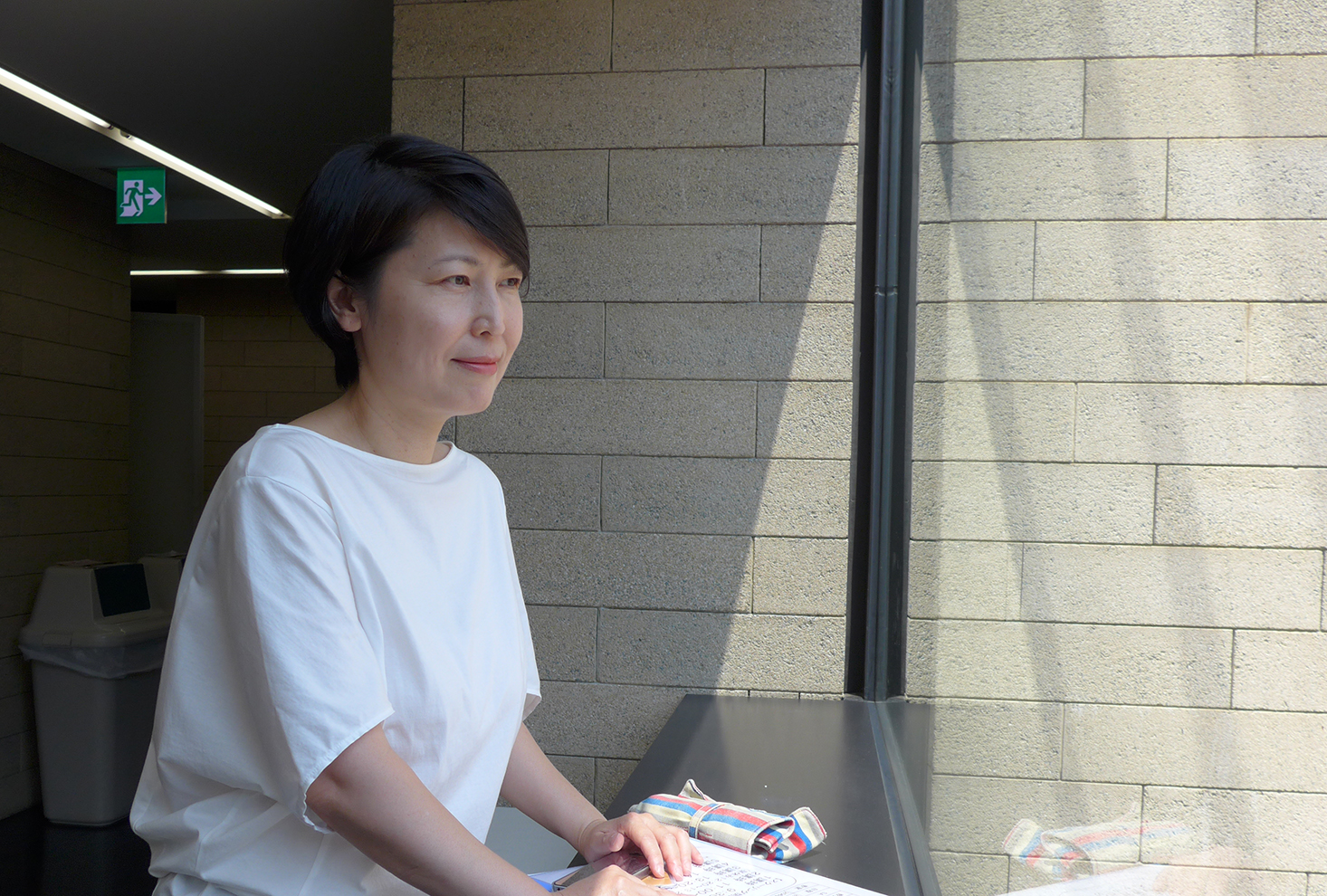
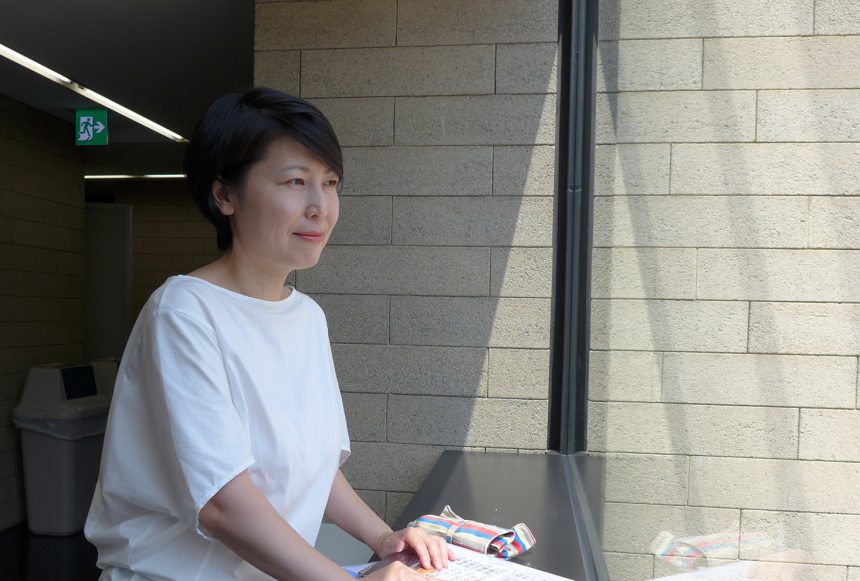
Professor Aya Kono
Q. What genre of classes do you teach?
I am in charge of graphic design exercises and courses that hone ideas and concepts. As this is a correspondence course, I provide correction guidance and hold classes as weekend schooling at the Kyoto and Tokyo campuses.
Q. The moment when the font's sensitivity was turned on
Gradually it became "ON".
When I was a student, I was surprised to learn about the existence of typefaces and that there are people who specialize in typing when I was working on a business card. When I joined a design production company, the workplace was in the transition from analog to digital, but I had the opportunity to type at a typesetter and was fascinated by Monsen's Latin typefaces. Through my work, I gradually got closer to type, and I still feel like I'm getting closer.
Q. What is your favorite Morisawa font and why?
Main Minchois.
The density of the font when viewed on a page with a large number of characters feels very natural. When I wanted to create something with this image in mind, it was close to the density of the design image I had in mind. It's become a staple font for me.
Q. What do you think of the students at this school?
The age range of students in the correspondence education department is very wide, but in the information design course I belong to, the majority of students are working adults in their 20s to 40s.
It seems like it's difficult to balance studying with daily life, but they are studying diligently. There are many highly ambitious people who continue to learn in order to improve their own abilities. People from various backgrounds gather here, and often they are taught in return, making it a place where people of all ages and backgrounds can learn from each other.
Q. The moment the switch turns "OFF"
In fact, it may be turned off often.
When I come across beautifully handled and designed letters, or conversely, when I come across undesigned, tightly packed line spacing, an unexpected choice of font, or a poster with handwritten text, I'm moved, surprised, amused, and endeared, and my font switch flips on. There are letters from Takeda Shingen and Toyotomi Hideyoshi at a temple near my university, and I find myself imagining the personalities of the warlords as I follow the shapes of the letters.
Q. What would you like to challenge yourself with in the future? What are you interested in?
Whether it's my work in education or design, it's rare that anything is the same as the previous year, so I enjoy encountering new things every day and every year. Right now, I'm preparing to take on the challenge of looking at design from a different field. I'm devoting myself to thinking more about the role of design in people and society, not just on my desk, so that I can have a broader perspective. There's so much I want to do! (Mountain climbing, for example)