

HAL College (Tokyo, Osaka, Nagoya) and Morisawa Inc. have collaborated on a project called "Turning on the Sensibility of Fonts."
The theme this time is simply "the feel of kanji."
The assignment was to choose one kanji character and visualize the image that character conveys using a typeface. In order to choose the perfect typeface to visually express the meaning of the kanji, it was necessary to carefully consider not only the method of expression but also the typeface. How did the HAL students tackle such a difficult assignment?
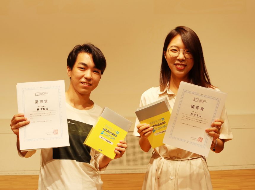
Here we introduce five works that Morisawa felt brought out the charm of the typefaces and were awarded with the Excellence Award!
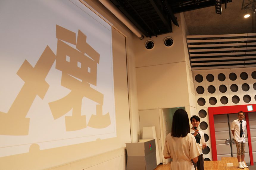
"Break" (HAL Tokyo, Daichi Hayashi) Font used:UD Shingo
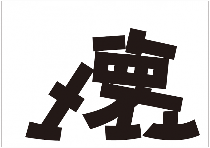
We asked them to express the character "破" (break) with the image of a toy, brick, or concrete block breaking. We chose a simple Gothic font to match the image of a square, cornered block.
It's a simple expression of breaking the character "破" (break), but I liked how it looked broken, yet still maintained a good balance so that the original character could be understood. I also found the idea of breaking a UD font interesting.
"En" (HAL Tokyo, Uchimochi) Font used:Moaria
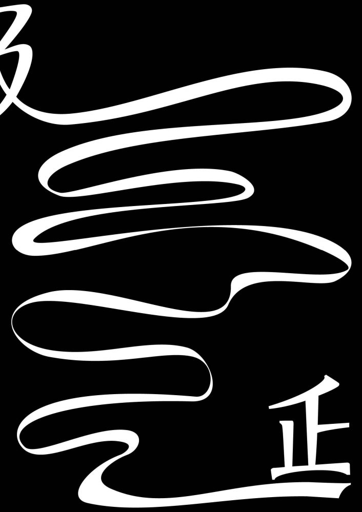
In order to express the sense of rhythm felt from the shape of the character "En," we chose "Moaria," an element with a rhythmic line.
I felt that the rhythm felt from the character "En" matched well with the interesting and light design of "Moaria" itself. The choice of weight, use of black and white, and placement were also well thought out.
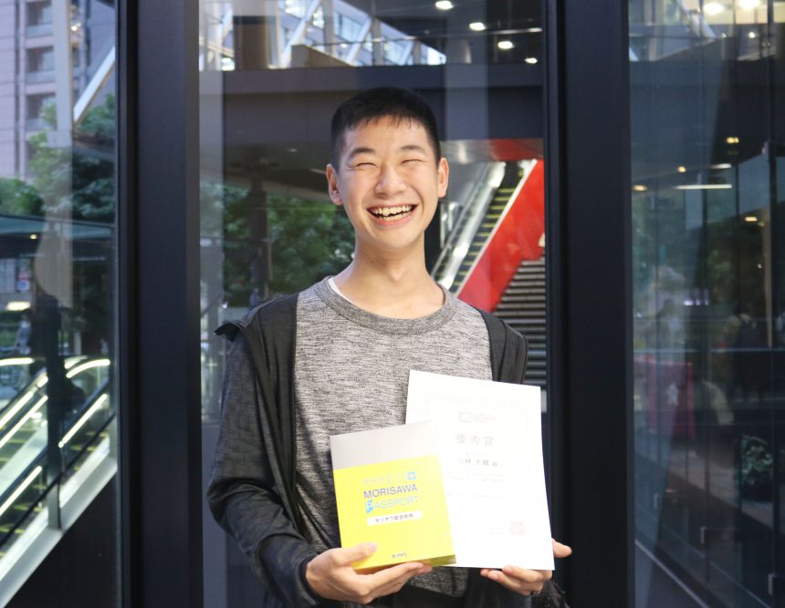
"Ei" (HAL Nagoya, Daisuke Kobayashi) Font used:Kakumin
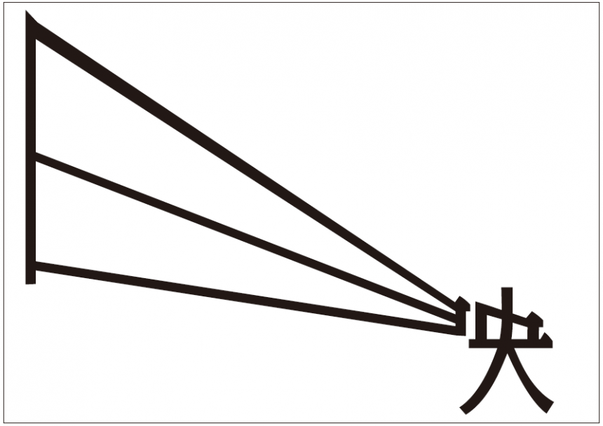
This is a unique piece that shows the "sun" (日) as light extending from the screen and projector, and the "center" (中) as the projector. The light is expressed with straight lines in Gothic font, and the projector parts with scales in Mincho font.
The point that was appreciated was that they understood that Kakumin's shape combines the characteristics of both Mincho and Gothic fonts and chose it as the theme for this project.
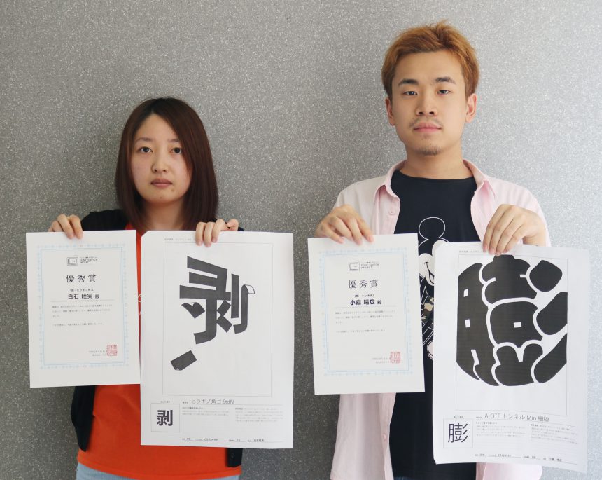
"Swelling" (by Yasuhiro Ogura, HAL Osaka) Font used:tunnel
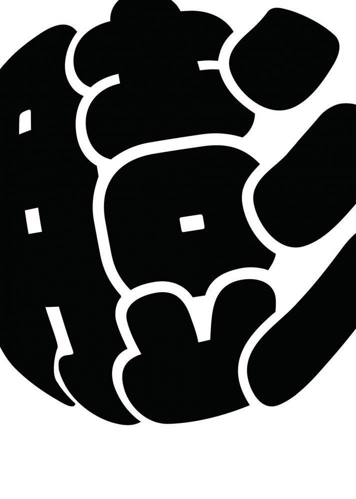
Making use of the indented elements of "Tunnel Thin Line," the piece has an impactful pop feel with a three-dimensional, balloon-like expression.
I looked closely at the typeface and it made sense that even though it was the same "tunnel" typeface, they chose "thin lines" rather than "thick lines" to create a more three-dimensional effect.
"Peeled" (HAL Osaka, Mutsumi Shiraishi) Font used:Hiragino Square Gothic
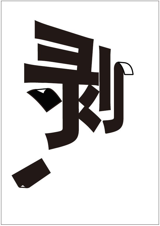
The appearance of posters and tape peeling off the wall was expressed using Hiragino Kakugo, which has a linear, thick, and flat feel.
It's easy to see at a glance what the designer is trying to express. It seems that the designer carefully observed the Hiragino Kaku Gothic element, which is flat but flares out slightly at the tip, and chose a typeface that conveys a physical image.
In the next article, we will interview the award-winning author!
Stay tuned.
HAL College (Tokyo, Osaka, Nagoya) and Morisawa Inc. have collaborated on a project called "Turning on the Sensibility of Fonts."
In the previous article, we introduced the assignment to "choose one kanji character and visualize the image that character embodies using a typeface," as well as the five works that won the Excellence Award.
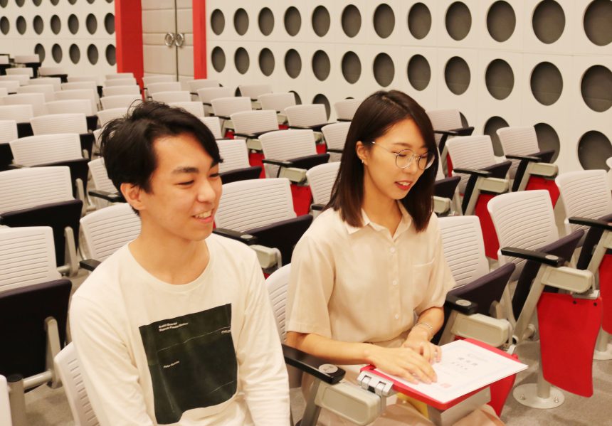
In this article, we will introduce interviews with the five winners.
Q. What was your impression after hearing about the issues?
Hayashi: "It seemed fun, and I thought I could do a lot of different things. I'd previously drawn illustrations themed around letters, so I thought this was an assignment I liked! (laughs)"
Woo: "I used to major in sculpture, and the assignment was to 'change the original shape,' so I felt a connection."
Q. How did you choose the typeface that best suited your expression?
Hayashi: "I chose a typeface that would suit the expression of destruction and checked the image."
Woo: "I first looked up the fonts on the font list page and decided on the font, but I was drawn to the rhythm of 'Moaria' at first glance and chose it."
Q. Was there a difference before and after tackling this issue?
Hayashi: "This time, I came up with a lot of ideas while consulting with my teacher. I learned to consider ideas that I thought were unlikely and then refine them."
Woo: "I wanted to be a 3D modeler, and for the graphics assignment, I didn't even know how to use fonts. But after working on this assignment, I started to think about how important text is in everyday life, not just in graphics. When I see advertisements or pass by them, I start to think about the fonts they use, and I think it has broadened the scope of my expression."
Q. What was your impression after hearing about the issues?
"I had an idea in my mind that something like this would be good, but it ended up being a pretty mundane idea. It was difficult to find a theme from there."
Q. How did you choose the typeface that best suited your expression?
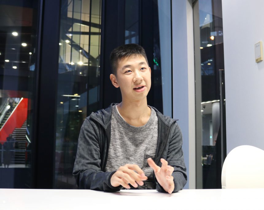
"As I was looking at and researching kanji characters, I came across Kakumin, which combines the characteristics of both Gothic and Mincho fonts.
It took a lot of trial and error to come up with the current shape, but with advice from my teacher, I was able to complete it by making the "sun" (sun) a linear light beam and the "center" (center) the shape of a projector."
Q. Was there a difference before and after tackling this issue?
"I didn't really care much about fonts before, and I would choose them vaguely for assignments, but now I'm paying more attention to them. When I learned about fonts, I realized it would be difficult to choose from all the available options. I originally enrolled in this school because I wanted to work for a novel game company, so I'd like to use a lot of fonts from now on!"
Q. What was your impression after hearing about the issues?
Ogura: "I thought, 'What does that mean?' (laughs) From there, I started thinking about the meaning of fonts that would suit my work."
Shiraishi: "I've always enjoyed thinking about what letters would go well with an illustration and enlarging the letters to look at them, so I thought this would be an interesting assignment."
Q. How did you choose the typeface that best suited your expression?
Ogura-san: "After coming up with various kanji ideas, the one that stuck out to me was '嵯' (bō). I was searching for a font that would be perfect for this character when I came across 'Tunnel' (tunnel), and I thought, 'What a cute font!' (laughs)"
Shiraishi: "I immediately imagined the kanji as meaning peeling, and among the straight-lined Gothic fonts, I was attracted to the fact that it wasn't too rigid."
Q. Was there a difference before and after tackling this issue?
Ogura: "My awareness of fonts has changed. I realized there are so many different fonts out there. I'm aspiring to be an animator, and I'd like to use this in my portfolio and other things from now on!"
Shiraishi: "I had never transformed letters before, so it was a refreshing experience to see how, by processing them to suit my image, letters could become part of a design, or even art."
Those of you who have worked on this assignment will now move on to more specialized fields. No matter what field you go into, the ability to explain in your own words how and why you chose a typeface will be useful in many situations.
I would be happy if this assignment served as an opportunity for you to "turn on your font sensitivity"!