The international typography conference "ATypI" was held from September 4th to 7th, 2019.
This year marks the 63rd anniversary of the event, and it was called "ATypI 2019 Tokyo," marking the first time it was held in Japan. In this memorable year, Moripass members also participated as volunteer staff.
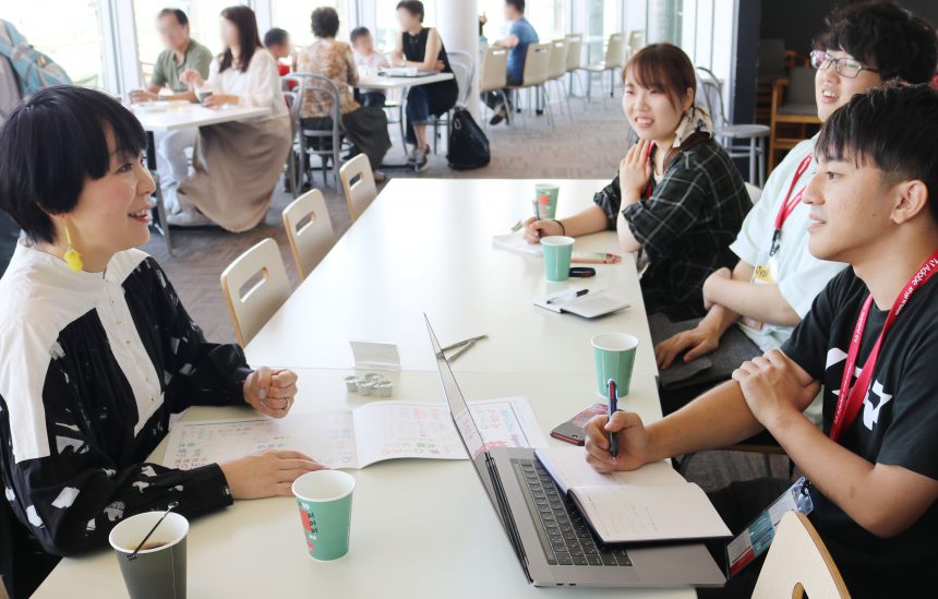
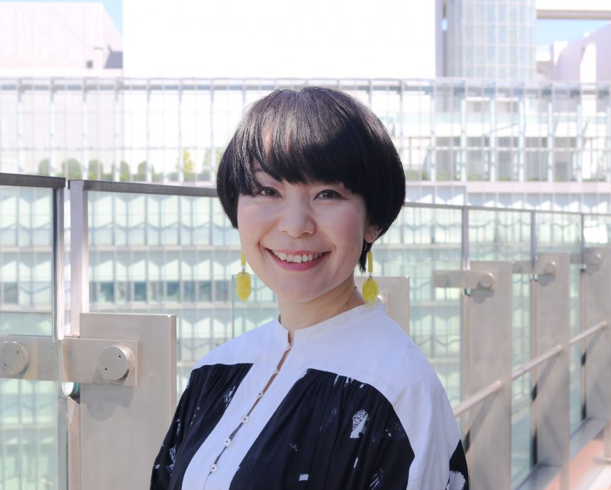
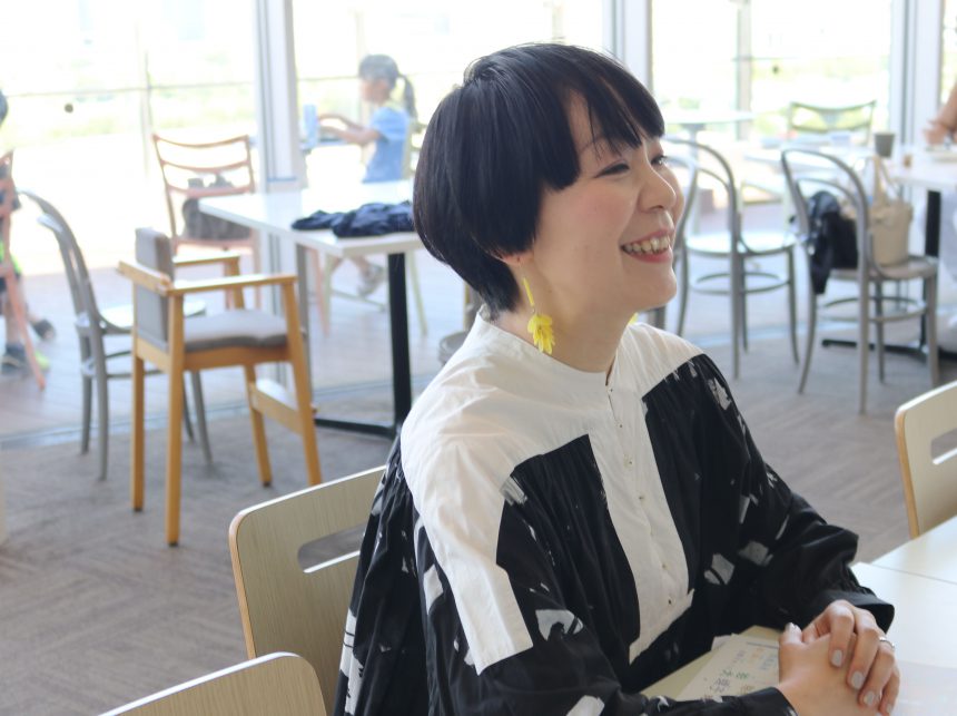
We had the honor of interviewing typeface designer Ryoko Nishizuka, who gave a lecture at ATypI 2019 Tokyo. We present to you her candid discussion about the current state of type design.
Interviewer and article writer: Shimizu Kanyo, Aoki Kanako (Moripass member)
Please tell us about your job.
I work as the chief type designer at Adobe Systems Inc. At Adobe, we have type teams in Japan and the US headquarters, and both teams work together to create fonts. For example, if we find something that suits a design created by the US team, we adjust it and put it into Japanese, and we also have original typefaces like Ten Mincho that we created in collaboration with each other.
Please tell us the moment when your font sensitivity was "ON".
I think it was when I was in the upper grades of elementary school. In the lower grades, the character "Kokugo" (Japanese) was included, but when I started using my own notebook, there were no titles, so I think that's when I first wrote "Japanese" or "Math" while imitating the structure of Ming style.
I learned that there was a job creating typefaces after I entered art school. I originally wanted to become an illustrator, but when I actually entered university, I found it quite difficult to draw pictures that came to mind without a client, like being given a theme by someone else. On the other hand, I was able to immerse myself in the work of lettering and writing letters. From that point on, I began to connect with my time in elementary school, and I started to think that it would be interesting to make it a career.
I think there are two types of work I receive: client work and work that clients request from me to create. I found it interesting that illustrations fall into the former category, while typefaces fall into the latter.
If you think about it, it feels the same with illustrations, but with fonts, it's easier for me to get the feeling that I've ordered a certain font for a certain situation, so I think that's what made it easier for me.
I wanted people to use my fonts rather than for my own use. I think that paintings and fine art are something that are sublimated within oneself and become a form of expression within oneself, but I realized that I wasn't that type of person.
For Nishizuka-san, fonts were the perfect way to express himself.
And you can enjoy it for quite a long time (laughs).
Creating a font is a long project that takes about two to four years. In my case, I can work on it carefully for such a long period of time, so I think it's a job that suits me and doesn't cause me much pain.
Which Morisawa font is your favorite and why?
A1 MinchoMy aim is to create a font with an exquisite balance that, when simply put together, makes you feel like it's good enough for a logo. Ten Mincho is one such font. So, like A1 Mincho, I have a certain admiration for typefaces that can be used for both displays and for short texts.
For display fonts, I used Yutaka Sato'sSumidaIt was a typeface I really admired. It's gothic, but with a classic form, and the kanji characters are in line with existing styles, such as headline gothic. The kana characters have a calligraphic style, but also a traditional form. I thought it was really well done.
What has been the most enjoyable part of creating fonts so far?
The most fun part is the sketch stage before starting the project. The most fun part is when you create a few letters and think, "Maybe this will work?"
However, most of the things that I think will work at this stage don't turn out to be successful (laughs).
So when a problem arises and you have to solve it, it's really fun.
Is there a moment when the font's sensitivity is "OFF"?
From what I've heard so far, it doesn't seem like much (laughs).
As I get older, the things I'm good at and have continued to do are actually the easiest for me, and because they're easy, I can continue doing them as work. So I usually make fonts, and on the weekends I go to calligraphy classes and practice writing characters there. I'm in a state where I don't really understand it myself, but I find that anything related to characters is the easiest.
I also sometimes go to Jimbocho and look for second-hand books.
Sample books from that time are rarely available, but if you look at old books you can see that typefaces from that time were used a lot, so I often buy books that use interesting characters, even if I don't care about the content.By the way, if you know the characters and can distinguish fonts, don't people say you look like an otaku? (laughs)
When you talk to famous designers, you find that they are truly type nerds. They tell you things like, "I want a typeface like this," or "This is easy to use," so you have to be a type nerd to study type design.Also, as someone who creates fonts, I think it's important to properly communicate how I created them. However, Kozuka from Kozuka Mincho often said that it takes 10 years for a font to reach everyone. Nowadays, it seems like it's faster with social media, but Ten Mincho was released two years ago, and even so, when I come across tweets saying, "I discovered a typeface called Ten Mincho," I realize that it's not that easy to reach people.
I imagine that you would think about what font is needed at the planning stage, but if it takes 10 years from release to delivery...
Ten years ago, smartphones were not yet widespread, so it seems like it would have been difficult.
My sense is that the cycle of type is slow, with the big trends of modern and classic rotating slowly in about 10-year cycles. I think we are now in an age of hybrids.
In the past, it was common to create a family font starting with Mincho. However, when it came to Source Han Gothic, we decided to create a Gothic font first, and that's how it began. It all started with the idea that it was a typeface for digital devices like smartphones, and I readily accepted it, so it really made me realize that times had changed.
It's like, "I'm changing the times without even realizing it!" (laughs)
Mincho is no longer the main typeface of the family, but has become a typeface that prioritizes its purpose. It is a typeface that should be used for vertically written novels and other things that are not Gothic or inorganic. But in the past, Mincho was not like that; it was in the starting lineup. Gothic was only used for annotations or when you wanted to look a little more modern, but before we knew it, the situation had completely reversed.
Fonts change as technology evolves.
I think we have responded to the diversity of devices used and where people most want to display the content.
I want Mincho fonts with thin horizontal lines, but on the other hand, I also want Mincho fonts with thick horizontal lines. But I don't just want modern Gothic fonts, I also want traditional Gothic fonts. In other words, I need something that perfectly suits the situation. As with Role, which was introduced at ATypI this time, I feel like fonts are becoming more diverse so that they can be used in a variety of ways.
Finally, what advice would you give to students?
I think the most important thing is to keep going. Even if you don't get results when you're young, it's important to keep doing what you love and to keep presenting it.
Especially in the case of type design, I think the longer you work at it, the more you'll shine in the later stages of your career, so I think it's important to keep on working steadily without giving up. I think that these days, everyone is so focused on looking good, and if you don't get any reaction on social media, it can be a little disheartening, but you need to overcome that. I hope you don't get distracted by those around you and continue to build up your skills.
He gave valuable advice to students aspiring to become type designers, as well as those who are not. Thank you for today!!