
The international typography conference "ATypI" was held from September 4th to 7th, 2019.
This year marks the 63rd anniversary of the event, and it was called "ATypI 2019 Tokyo," marking the first time it was held in Japan. In this memorable year, Moripass members also participated as volunteer staff.
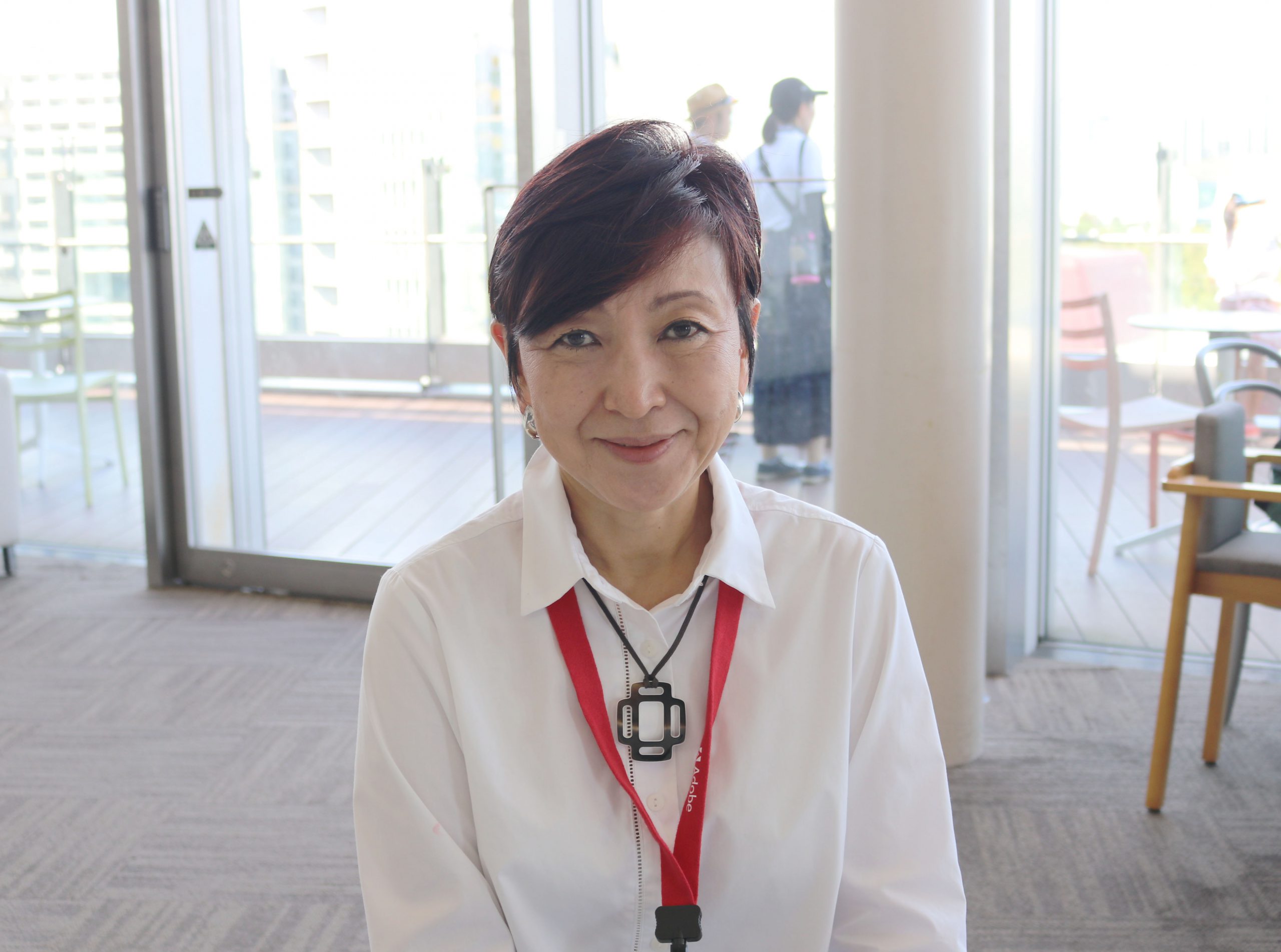
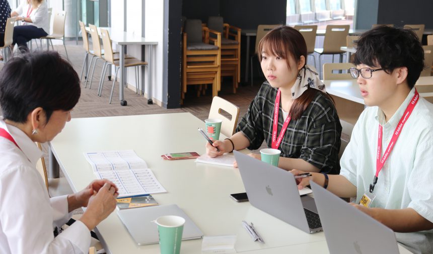
We also had the privilege of interviewing designer Yuki Kikutake, who gave the keynote speech at ATypI 2019 Tokyo. We'll share with you how he gave some warm advice to the younger generation to the slightly nervous Moripass members!
Interviewer/Article: Hiroki Ishii, Mei Shirimuhama (Moripass member)
First, please tell us about your job.
My main work is graphics related to space and the environment. I also teach visual communication design at Tokyo Metropolitan University.
In addition to spatial design, you are active in a wide range of fields, including book design. Why do you choose to try your hand at various things rather than just one field?
While working at the Nippon Design Center, I began to think about what my originality was, and so I went to Italy to re-study architectural design, which was the starting point of my studies.
In Italy, many architectural firms also handle sign planning and graphic design. My experience of working in this field from my late 20s to early 30s is the reason why I don't choose a particular field. However, my main focus remains graphics related to architecture and the environment.
Your current way of thinking is based on your study abroad in Italy.
Yes, I was inspired by the relationship between graphics and the environment that I experienced in Europe.
My next question is, what first got you interested in fonts? Was there a moment when your sensitivity to fonts was "ON"?
In graphic design, text is an essential form of communication, and I believe that the choice of text is a test of a designer's sensibility.
When I joined Nippon Design Center in the 1980s, it was the era of phototypesetting, so senior designers thoroughly trained me in typeface selection and composition. Nowadays, you can change fonts on a PC and try out various character types, but I still want to maintain the same sense of tension when working with letters as I did back when I was working with phototypesetting.
Mr. Kikutake, you are particular about type, but what kind of fonts do you like?
In the Japanese civilization and court style,Ryumin.
When I typeset, I try Ryumin at least once.A1 MinchoI also like it.
I like traditional fonts.
The level of perfection is so high. I feel safe knowing there are no mistakes. I've been using Ryumin since my twenties, so I've been using it for 40 years now.
On the other hand, when it comes to Western characters, I try to choose typefaces more freely and with an awareness of the times.
Ryumin gives me a sense of security that makes me want to just give it a try.
Many of Kikutake's works feature memorable letters. Do you keep your favorite fonts in mind when choosing fonts?
Rather than focusing on my likes and dislikes, I think about what typefaces are appropriate for the space and architecture. I consider the typeface and lettering design in a comprehensive way, taking into account the type of space, who will be using it, and the intended use, as well as the architectural design and finish.
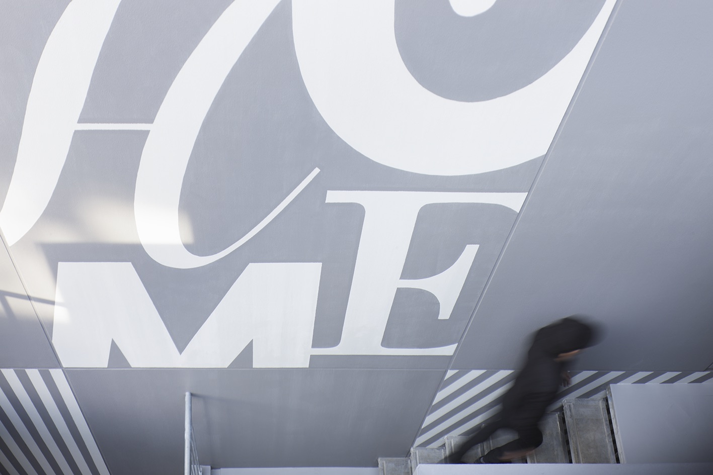
I was really impressed by the design of the apartment complex for single people that you talked about in your lecture. By applying the "HOME" design to the walls that give off an inorganic, cold urban vibe, it creates a warm atmosphere that makes you feel at home.
I'm glad my thoughts were conveyed.
The apartments are for single people with an average age of 20, and the private rooms are not particularly spacious, so the architect asked us to make the most of the public outdoor stairwell wall with graphic design. Therefore, to make the residents feel like they are at home, even though the apartment is small, we created a wall with a geometric pattern and the word "HOME." The word "HOME" is designed using a combination of four different typefaces.
Project Narashino
Architect: Takenaka Corporation
Photo: Nacasa & Partners
To choose a font that matches a design, it's important to first understand the font. Are there times when you turn off your sensitivity to fonts?
I feel like I'm always on the lookout for letters.
I am intrigued by the letters used in all sorts of places around town and often find myself wondering what typeface they are.
The font sensitivity is always "ON."
These days, I mostly use my iPhone to record things that catch my eye, but when I think about it, I'm surprised at how often I end up taking pictures of text.
Finally, as you are also a teacher, I imagine you have many opportunities to interact with many students. Could you give some advice to students?
There are two anecdotes I'd like to share. One is when the person I asked to do letterpress printing asked me, "Do you know how the typeface you're planning to use was created?" At the time, I couldn't answer. They then said, "It's fine to use it knowing how it was created, but it's not okay to use it without knowing." Those words were shocking, and I still remember them clearly.
The second story is from the United States. At presidential election rallies and the like, candidates use placards bearing their slogans. I recently heard from Morisawa that the typefaces they use were developed specifically for the election campaign, and serve to communicate the slogans in a fresh and widespread way. I want people to remember that type has a very strong ability to communicate, and is a form that conveys our feelings.
It is important for us, the younger generation, to convey the correct use of fonts and their fun aspects.
That's right. I think it would be meaningful for everyone, not just students studying graphic design, to share with people of your generation the fascinating power of letters and fonts to give shape to our hearts.