Nihon Kogakuin Hachioji College and Morisawa Inc. have collaborated on a project called "Turning on the Sensibility of Fonts."
The ability to choose the perfect typeface for your expression and overall design skills are essential not only for students studying graphic design, but also for students studying illustration!
...So, we asked students in the Character Design course of the Manga and Animation department to take on the task of "analyzing the characteristics of Morisawa fonts and creating characters (anthropomorphizing them) that would convey their appeal."
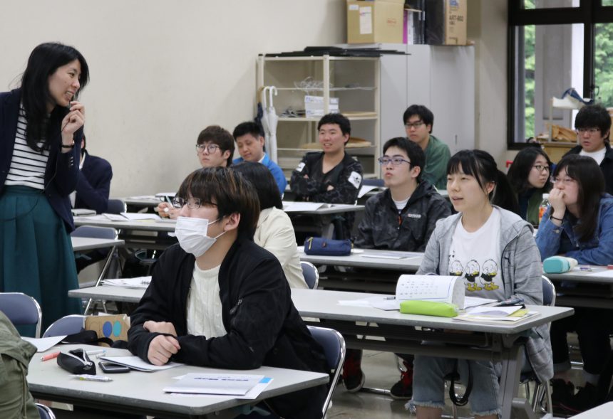
For many of the students, this was their first time thinking carefully about typefaces. First, they attended a seminar to understand how to look at typefaces, and then they chose the theme font they wanted for their character.
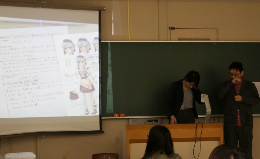
For the mid-term presentation, students used a sheet to go through the process of expressing the typeface as "words" and then turning them into character designs.
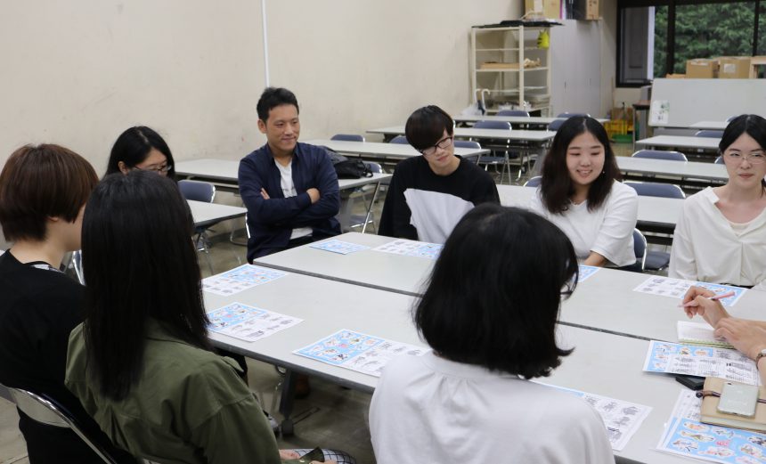
And then the final announcement came!
"This typeface also has a historical background."
"This typeface is used in places like this."
It was impressive to see that everyone was able to use the advice from Morisawa during their interim presentations to create more evolved works and more persuasive explanations!
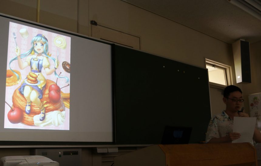
The presentation was impressive, incorporating various elements into the design, such as the atmosphere of the typeface, the shape of the elements, the story behind the typeface's creation, and typical uses.
Also, the unique character settings and detailed worldviews that only students studying character design can create were refreshing. I'm impressed by everyone's rich imagination!
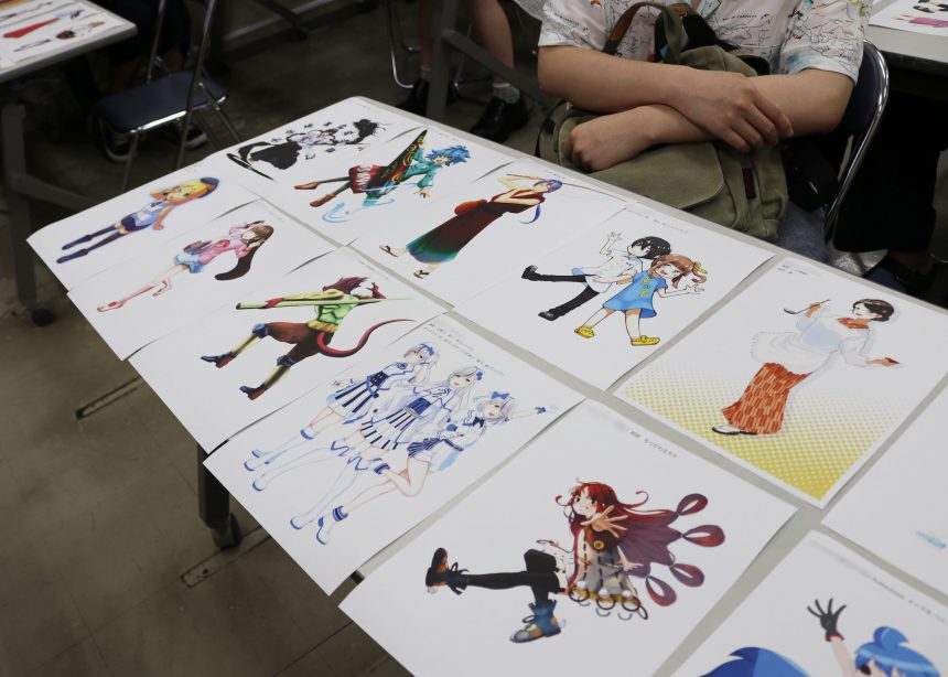
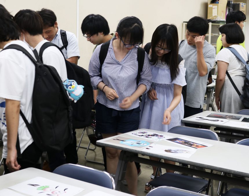
Once all the attractive characters have been selected, the judging process begins.
This time, we have prepared two awards: the Popularity Award, which will be given to illustrations that receive a lot of support, and the Morisawa Award, in which Morisawa will judge the illustrations and actually turn them into novelty items.
The Popularity Award was decided by the students' own votes! Everyone was voting seriously in front of their classmates' masterpieces.
What kind of character was chosen?
Don't miss the next article!

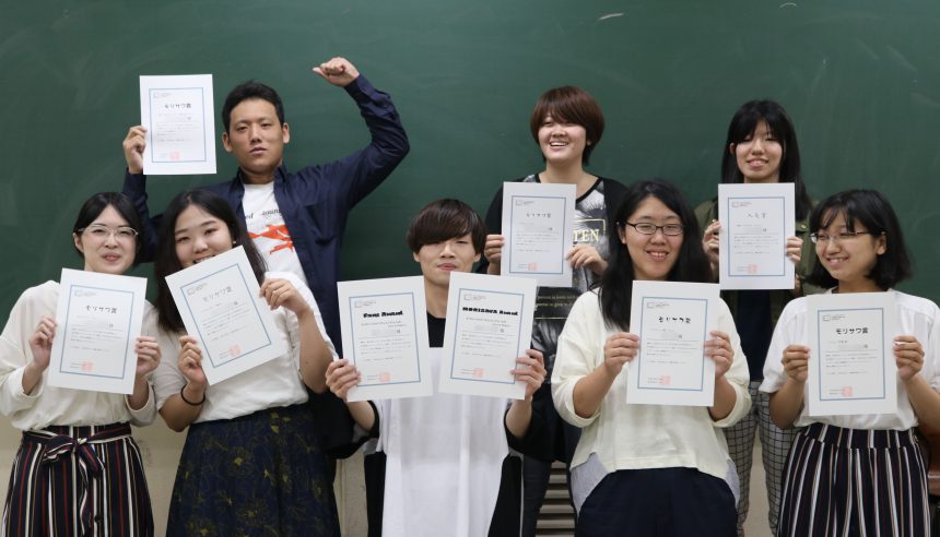
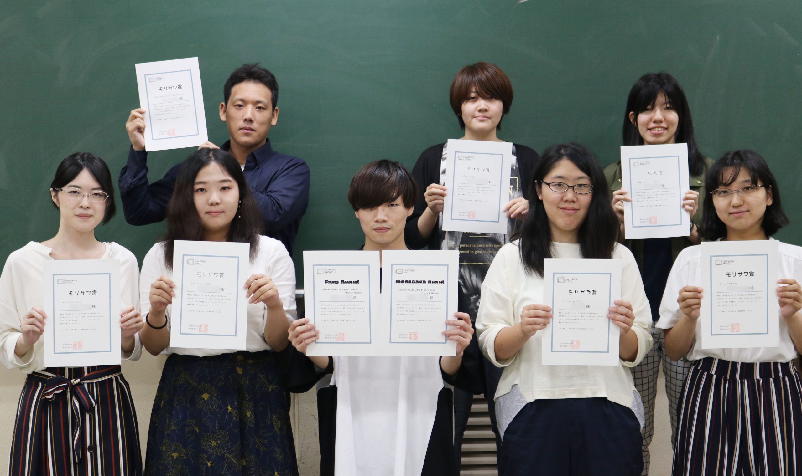
In the previous article, we covered the process leading up to the final announcement.
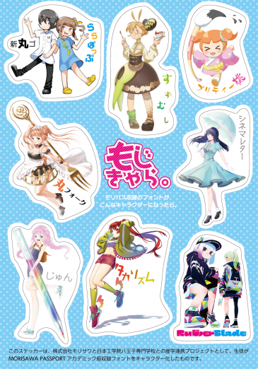
The winning works were two for the Popularity Award, which was decided by student voting, and eight for the Morisawa Award, which will be made into novelty goods.
We will introduce the winners, their theme fonts, and their comments.
Popularity Award
・Hiromasa Shinohara
."RubberbladeIt expresses the cool image of " and its stylish composition and color scheme made it the most popular among students.
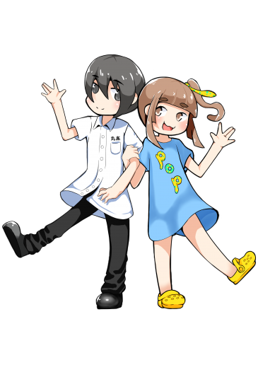
・Yuka Hara
Handwritten font "NakinThe cute design, which incorporates elements of "Kawaii Anime" in the clothes and hairstyle, was ranked second most popular among students.
Morisawa Prize
・Haruhiro Matsukawa
Basic round gothic font "Shinmarugo" and casual kana font "LalapopHe clearly explained how these words can be used in combination.
・Misuzu Nakamura
."Suzumuri" and the design was created so that it would be clear at a glance which typeface was used as the character, based on the typeface name.
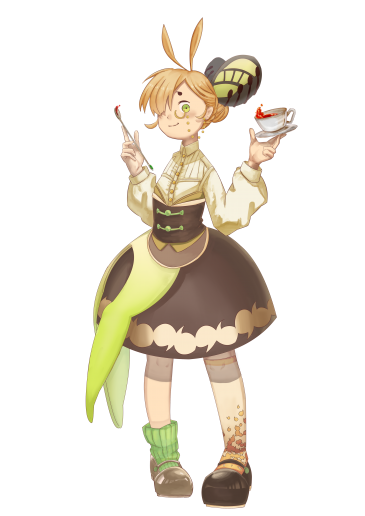
・Azami Moe
."Pretty Peach" was highly praised not only for its pop style, but also for its design that focused on the calligraphy style and items that showed brush strokes.
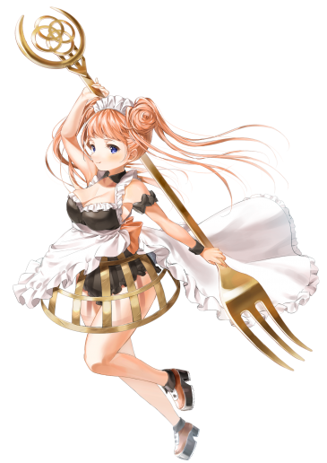
・Riho Nakahara
."Round forkThe typeface was carefully analyzed and designed, including a crinoline that mimics the relationship between the vertical and horizontal strokes of "."
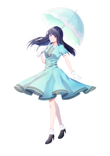
・Chiaki Uchiyama
Subtitle-style font "Cinema LetterThe classic and elegant atmosphere of the book perfectly matches the style of the illustrations, and the design is full of attention to detail.
・Yuka Tanigawa
A familiar round gothic font that is also used in picture book text.Jun" was incorporated into the worldview of the characters living in the picture book world.
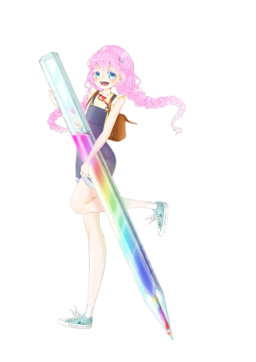
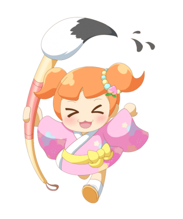
・Misaki Kobayashi
."Takarism"The character is depicted in a dynamic pose, making use of the distinctive circles and triangles of the character.
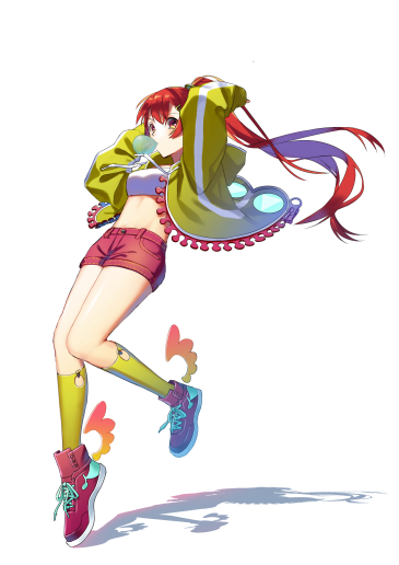
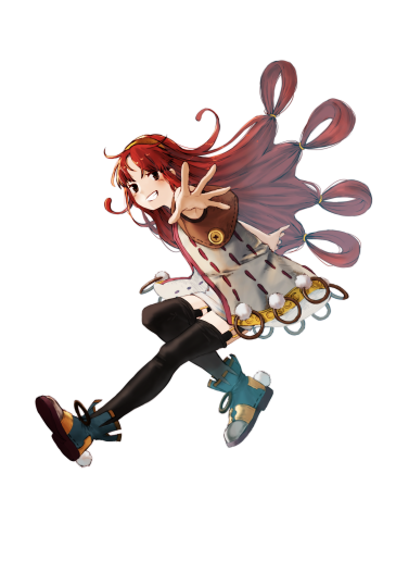
・Hiromasa Shinohara
There is a lot of blackRubberbladeThe design was created by capturing the characteristics of the product.
Shinohara is a proud double winner of the Popularity Award and Morisawa Award!
We interviewed the winners in a roundtable discussion to hear their honest thoughts!
Q. What was your impression when you first heard about this assignment?
"I couldn't imagine anthropomorphizing a typeface, so I thought it would be difficult!"
"I had just started to become interested in letters after getting into chalk art (the art of drawing pictures and letters on a blackboard), so it was a lot of fun!Suzumuri” It was love at first sight too.”
"The theme itself was interesting, and I wanted to take advantage of the characteristics of the typeface, so I had a lot of fun designing it!"
Q. Were there any difficulties you faced when designing the characters?
"It was the most difficult assignment I've ever had to do! (laughs) At first, I had a completely different character design, but I asked my parents and friends who aren't illustrators, 'Does it look like this typeface?' I got negative feedback, so I seriously rethought the design."
"I wasn't familiar with personification itself, so I didn't know what to do, and I watched everyone's midterm presentations and learned, 'Oh, so that's how it's done.' From there, I read the explanations in Morisawa's typeface samples and picked out a few that I thought would be easy to draw."
It seems that many students found the task of "personifying a typeface" difficult, as it was something they had never thought about before.
Q. Did you notice any changes before and after starting the assignment?
"I think I've become more interested in fonts than before. I learned that even similar fonts have different personalities in each individual character, so I've been able to enjoy choosing from the countless fonts available. Also, whereas before I'd just looked at fonts, by looking at them with more knowledge, I think I can now feel their charm and atmosphere more clearly."
"Until now, I'd often designed characters intuitively, thinking, 'I wanted to do this, so I did it this way!' But after learning about the differences in the impression people have depending on the size of the pockets and the shape of the letters, I was able to make progress with the design and enjoyed working on it until the very end."
Although everyone struggled with the assignment, it was clear that they had given serious thought to the font.
The novelty stickers featuring Morisawa Award-winning works will be used to further enhance the font's sensibility in the future!
Thank you to everyone in the Character Design Course, Manga and Animation Department, Nihon Kogakuin Hachioji College!