
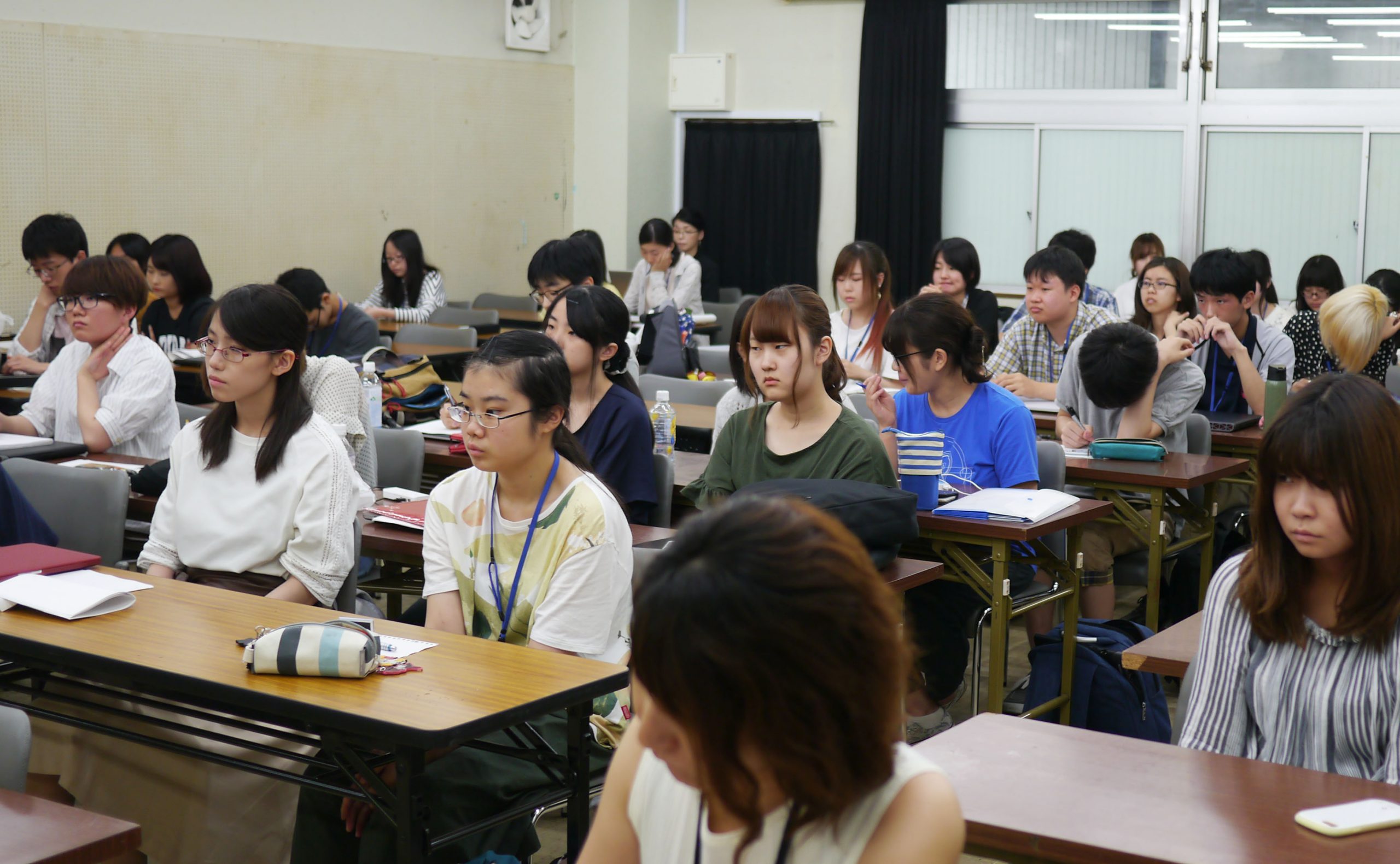
Starting in July 2017, we held an intensive seminar as part of a collaborative project with Toyo Art School called "Turning on the Sensibility of Fonts."
The theme of this event was "Novelty goods that convey the importance of fonts to students." We asked fellow students at the Toyo Art School to come up with ideas!
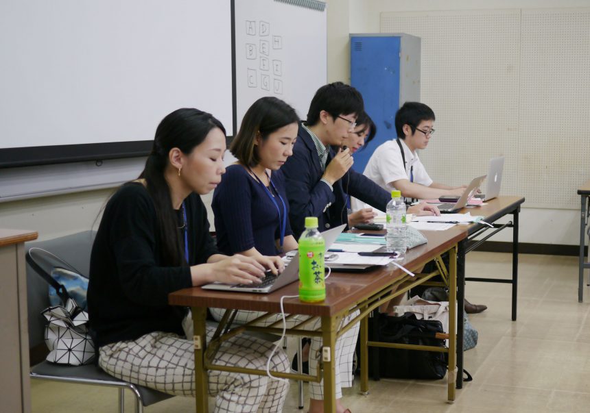
This is the first class to bring together students from all majors in the Creative Design Department, including the Advanced Communication Design, Advanced Graphic Art, and Advanced Product Design majors. We will use each student's area of expertise to think about what they can do.
First, you will learn about the role of fonts, and then, when preparing proposal materials, you will think about how to layout the characters and elements to make the materials easy to read.
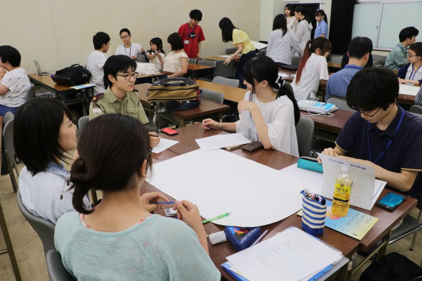
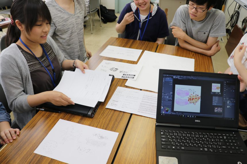
After the lecture, the students split into groups for discussion. Each group used a large piece of white paper to come up with ideas for what kind of items would convey the appeal of letters and fonts to their fellow students.
This was the first time for everyone to consider not only the appeal of fonts, but also their budget and the company's objectives. Struggling to think from a different perspective than before, they researched the websites of novelty goods companies and printing companies.
Perhaps the novelty goods Morisawa has released so far can provide some inspiration for ideas?
The group's color is reflected in their ideas!
Here we will introduce the progress of the novelty goods ideas that each group came up with.
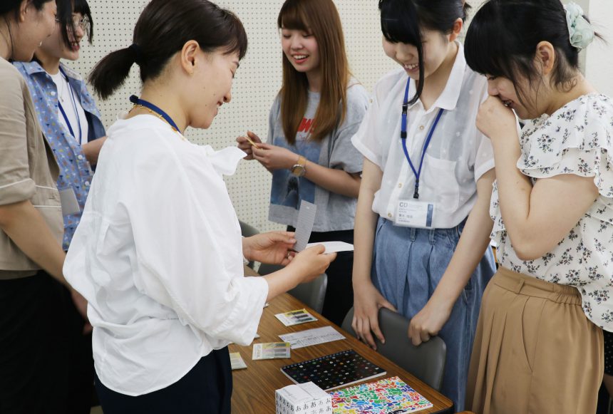
Before the final presentation, the Moripass club advisor joined us to discuss how to proceed from here.
This group chose a font that matched the image of "onomatopoeia that young people like" and came up with a sticker design. Not only did they consider their personal impressions of fonts, but they also researched the characteristics and history of fonts, which I think led to a very satisfying choice!
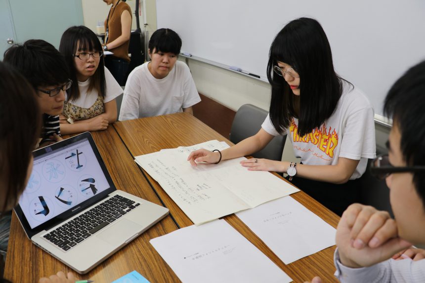
This group focused on the distinctive "shape" of the Ming typeface when designing the tin case. I was delighted that they shed light on a somewhat nerdy subject, the "Eight Methods of Writing Eternal" (originally a classification of various brush strokes based on the regular script character "Eternal." The character "Eternal" is thought to encompass all brush strokes).
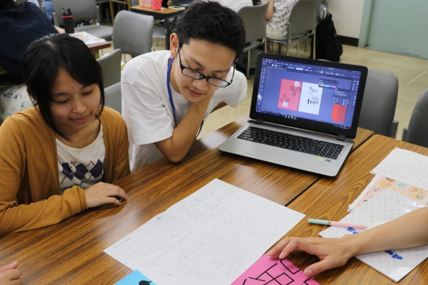
This group came up with a file design with encouraging words on the theme of "Support for the student generation." A great design requires the creator's passion. We're looking forward to seeing the passionate presentations from the group!
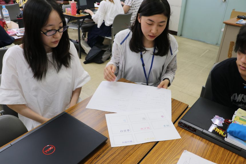
This group combined "font design," "words," and "characteristics of paper soap" to come up with individual designs. We have a feeling they will be able to create stylish goods that students will be happy to receive!
Each group was asked to propose novelty goods that would "activate their font sensibilities" and reflect the unique colors of their group.

Now, with advice from their advisors in mind, the students will begin to work on their ideas. Which group will win the prestigious Grand Prize and Novelty Prize?!
To be continued next time!
Toyo Art School, a vocational school run by educational corporations
www.to-bi.ac.jp

The final presentation day has finally come for the industry-academia collaboration project, a collaboration with Toyo Art School, which asked students to come up with novelty goods that would convey the importance of fonts.
For the students, it was their first time to present in front of a company, and although they were nervous in front of the judges, they made a confident presentation.
The Grand Prize and Novelty Prize winners have finally been decided!
Group B won the prestigious "Grand Prize"!
They suggested "font art stickers."
The design that made the most of the font's characteristics was the deciding factor, and they delivered a highly polished proposal.
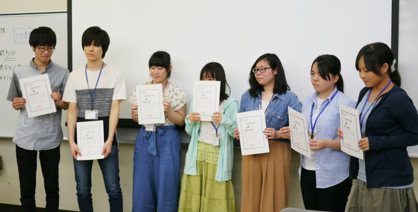
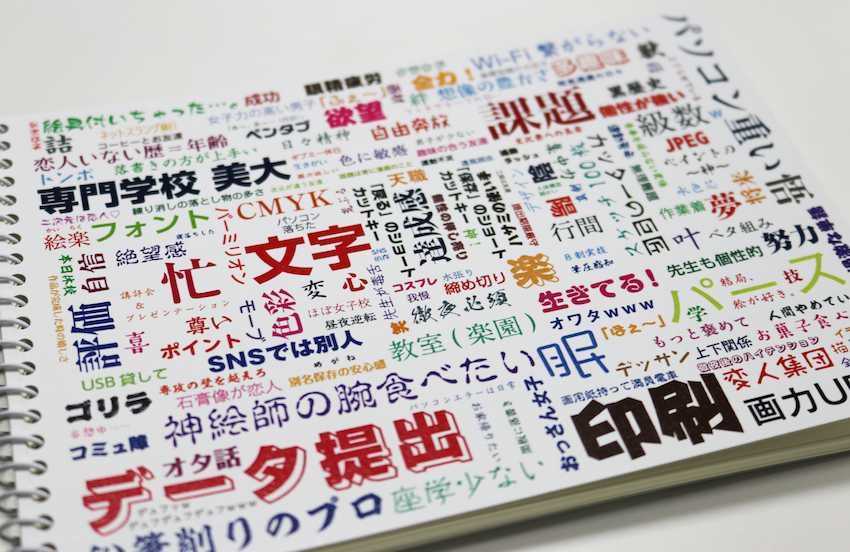
Group D won the coveted "novelty prize"!
He suggested a "word cloud style sketchbook."
A sketchbook can be used for sketching as well as taking notes and doodling, making it a must-have item for art students.
On the cover of this sketchbook, we have scattered words that are common among art students (?) and chosen a font that we thought would suit them perfectly. Another great touch is that on the back cover, you can see the typefaces used for the common words.
The judges were also very interested in the unique proposals that only students could come up with.
The sketchbook, which you can carry around with you at all times, allows you to enjoy learning about fonts, allows you to experience the rich variety of fonts, and can also be used as a small typeface sample book, all of which contributed to the high evaluation.
A unique novelty item that lets you enjoy fonts!
A few months and several design tweaks later, the sketchbook is complete!
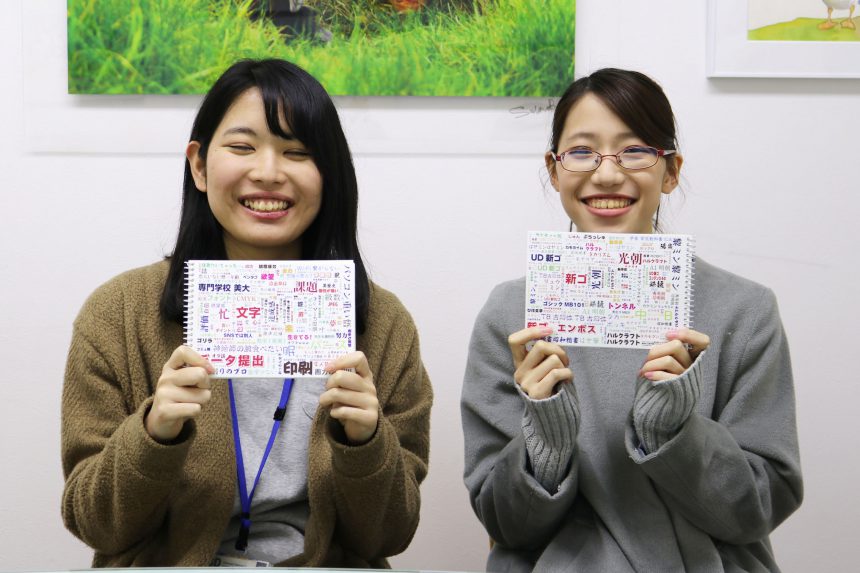
Nozomi Sakamoto (left in photo) and Kanami Oda (right in photo), who were in charge of the main design for the group, spoke with sketchbooks in hand about the joy they felt seeing their proposals take shape.
"As I was creating the designs, I also ended up memorizing the names of the fonts. I began to realize that the fonts I had researched were actually being used in everyday life," he said, revealing that his sensitivity to fonts was also turned on while he was creating.
The sketchbook will be used at future Morisawa certified school seminars and other events.
When you hand out novelties at your school, be sure to take these ideas into consideration and use them!
Toyo Art School, a vocational school run by educational corporations
www.to-bi.ac.jp