
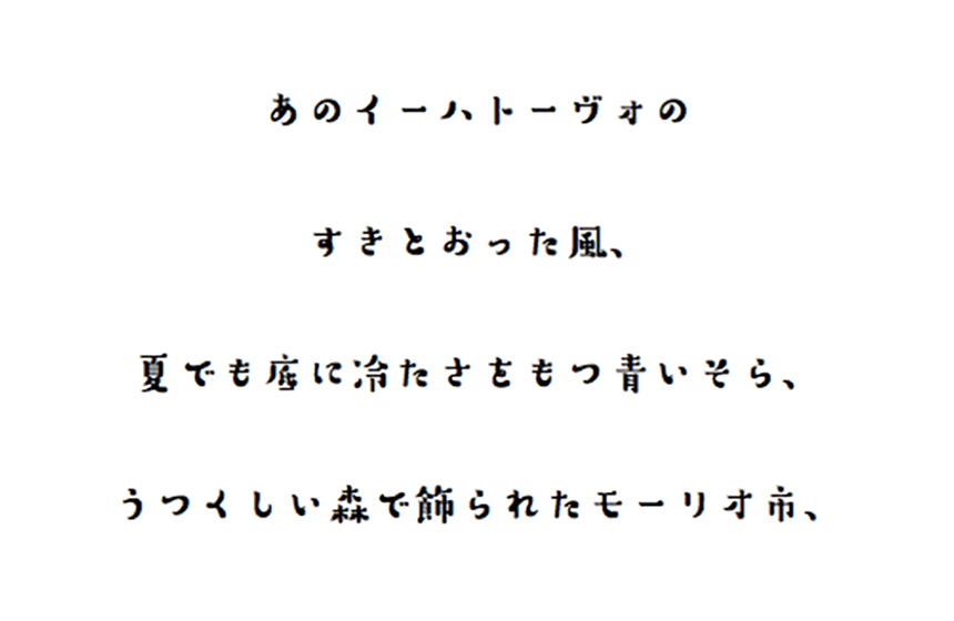
If the font on the guide signs was "Suzumushi"
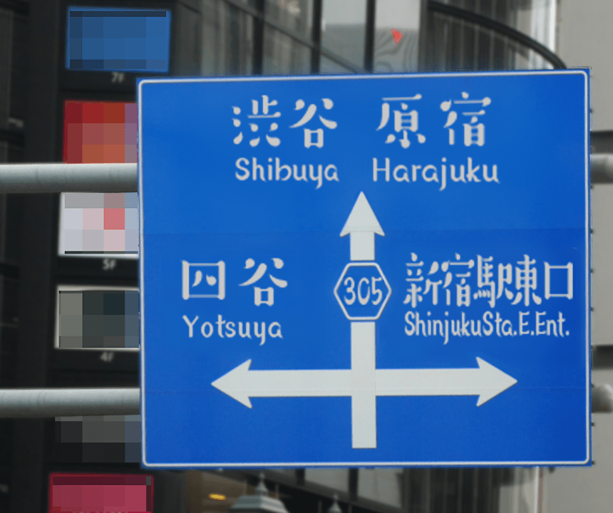
Those blue signs that you always see on major roads are called guide signs.
What would happen if that sign, which is usually written in a highly readable and simple Gothic font, was super cute? For example, what if it was the currently popular character, "Suzumushi"?
I was thinking about this when I created this image, but the cute townscape somehow ended up looking pop and fashionable, but also a little pompous. I could sense the awkward gentleness of the usual Gothic fonts... but it was also surprisingly easy to read and excellent. As expected...
If the ingredients label on milk was "Suzumushi"
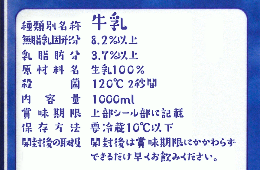
In the previous article, I was shown how surprisingly excellent it was, so this time I decided to be a bit mischievous and turn the milk ingredient label into a "cricket" font. It turned out so stylishly pop that I wondered if it was really necessary for milk that was on sale. I was nervous about typing "non-fat milk solids" and "pasteurized" in this font... but it also somehow made it look delicious, even though crickets are insects!
I'm a little jealous of how good "Suzumushi" is.
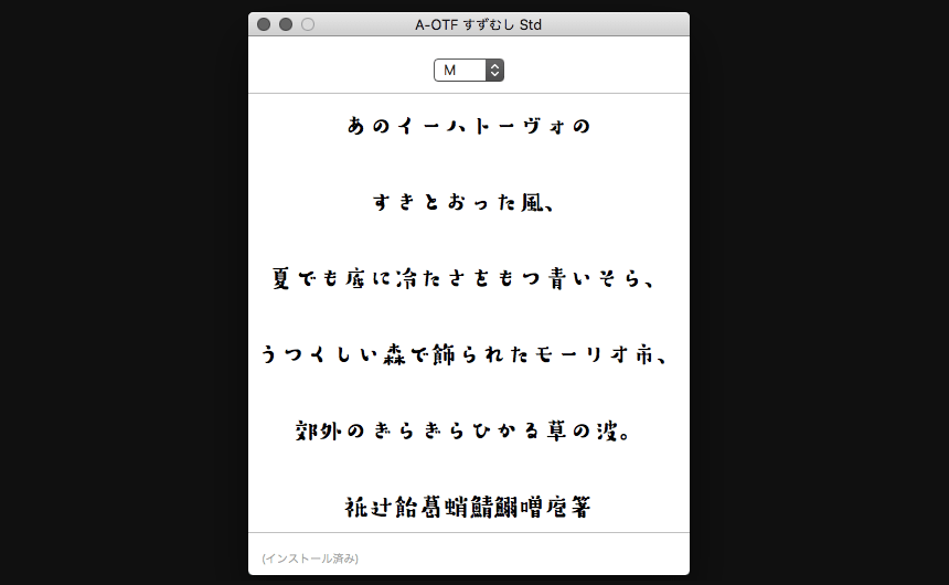
While writing these two articles, I have been defeated by the overwhelming cuteness and excellence of "Suzumushi", but when I think about it, this is only natural.
It is a highly talented font that won three awards in the Japanese section of the Morisawa Type Design Competition 2012: the Morisawa Bronze Award, the Akashi Award, and first place in the fan vote.HereYou can check out the included products, download usage samples and composition samples, and even try them out using web fonts! Give it a try!
(Person in charge: Moripass Department Nakkano Nakano)
This project is being handled by the official student members of the FONT SWITCH PROJECT, the "Moripass Club" students.