
Mode Gakuen (Tokyo, Osaka, Nagoya) and Morisawa have collaborated on a project called "Turning on the Sensibility of Fonts."
The theme of the assignment was "Proposing novelty goods that will deepen understanding of UD fonts." Participants were asked to design novelty goods that would encourage people, such as members of the public, to think about the significance and design of UD fonts, targeting those attending events hosted by local governments.
In addition to the Grand Prize and Excellence Prize, attractive novelties will be made into reality as part of the Planning Prize!
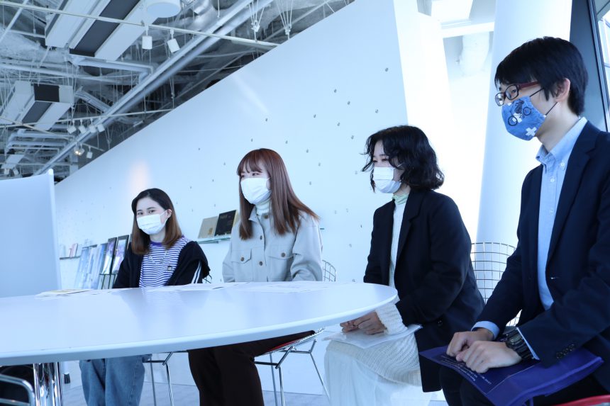
This time, everything from a seminar on "What is a Universal Design Font?" to mid-term checks and presentations was conducted online, transcending the boundaries of the school. With an eye on future job hunting, the students will also hone their skills in communicating their ingenuity in an online environment.
For the final presentation, 10 teams were selected after the mid-term check to give more detailed presentations. They proposed a variety of ideas, including novelties that encourage curiosity and learning, such as a set of a magnifying glass and booklet that allows participants to observe the characteristics of UD fonts, and novelties that take into account the current situation, such as a "Let's be closer" message to close the emotional distance between family members.
As a result of the judging, the following teams were awarded prizes:
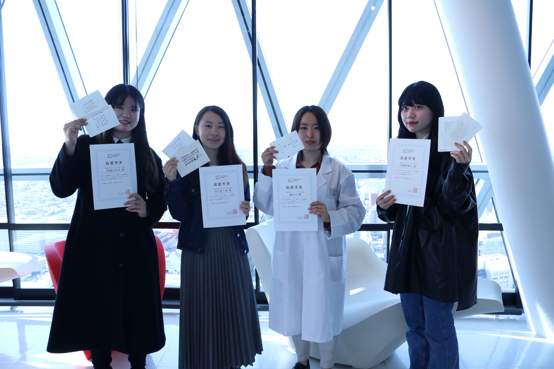
Grand Prize: Nagoya School Team 5 "Mystery Letter"
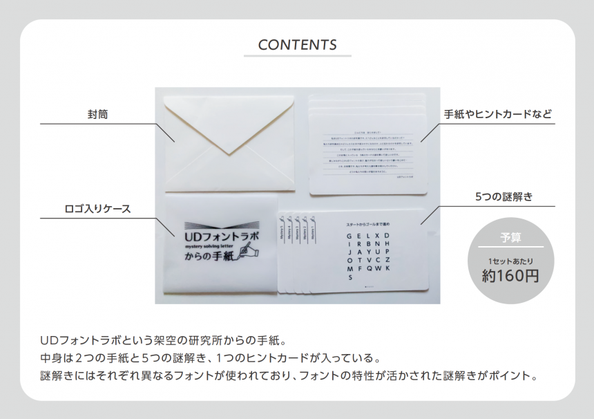
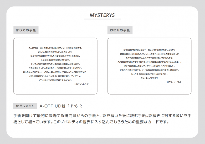
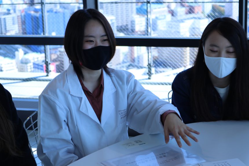
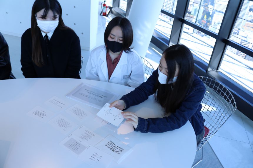
We received a proposal for a project that utilizes popular puzzle-solving techniques to "convey feelings like a letter and provide excitement through solving puzzles."
The story begins with a letter received from a fictional research institute called "UD Font Lab," making this an appealing novelty item that allows you to experience the world of UD fonts while having fun solving the mystery.
Excellence Award: Nagoya School Team 1 "Emergency Evacuation Bag"
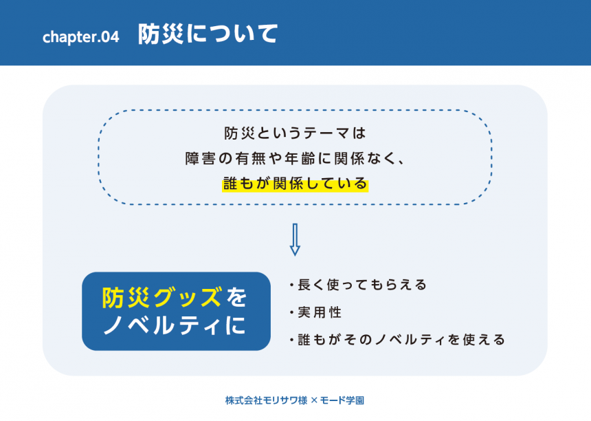
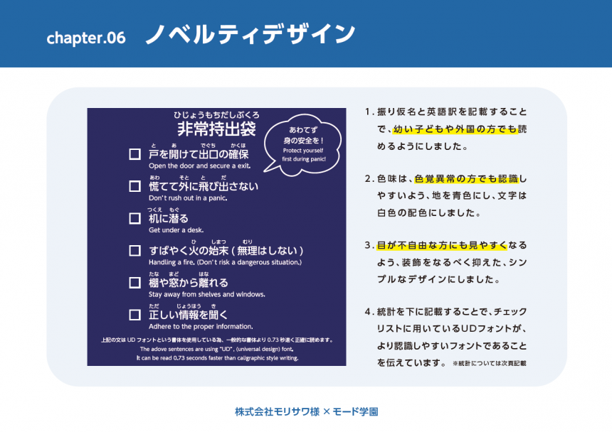
Taking the unique feature of UD fonts, which allows them to accurately convey information to a wide range of targets, we received a proposal on the theme of "disaster prevention."
The knapsack-style carry-out bags feature thoughtful wording that is considerate of children, foreigners, and people with disabilities, and the packaging includes an explanation in UD font, making them a key point of consideration.
Planning Award: Osaka School Team 4 "Handkerchief"
Tokyo School Team 10 "Leisure Sheet"
The Planning Award went to two teams who proposed novelty items that can be played like Twister. We will use these two project ideas to create novelty items in the future!
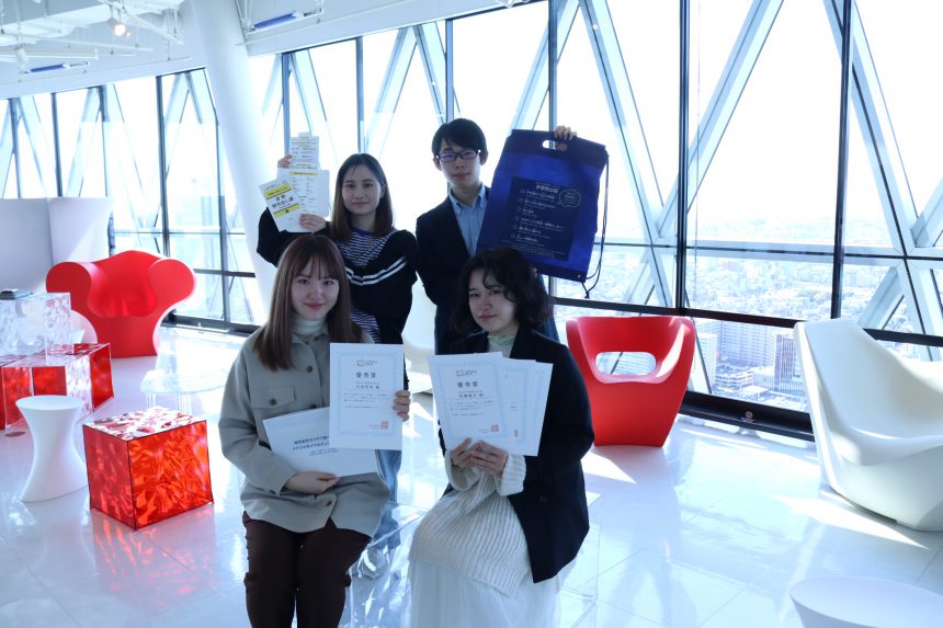
In the next article, we will introduce interviews with the two teams that were selected as the Grand Prize and Excellence Prize winners.
We present an interview with the two teams that won the Grand Prize and Excellence Prize for the challenge of "Proposing novelty goods that will deepen understanding of UD fonts."
■Grand Prize: "Mystery Letter"

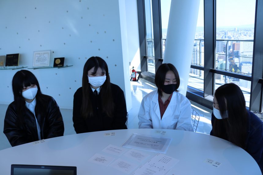
■ Nagoya Mode Gakuen Graphic Department Nagoya Group 5
Nanami Kawai, Mariko Nishihashi, Ayu Minoya, Ayano Mori
What was your impression when you heard about the assignment?
It all started with the question, "What is a novelty?"
I was thinking of creating a project based on designs of common items like tote bags and ballpoint pens, but I was asked to come up with a project using UD fonts as the main focus, so I started out with the question, "What is the relationship between a novelty project and a font?" (laughs)
Please tell us what inspired you to start this project!
We felt that ordinary novelties would not be interesting, so we decided to come up with a plan that no other team had done, one that would allow people to experience UD fonts in a fun way.
When it came to getting people to enjoy the game, we focused on what would attract people's attention, such as using Tokyo Metro's puzzle-solving games as a reference, and proceeded with the planning. As it was a universal design project, we wanted to create something that many people could enjoy, so we also used various games such as board games and sugoroku as references.I have never really felt that characters were difficult to read in my everyday life, so I proceeded while understanding the characteristics of UD fonts, which take into consideration the difficulty of seeing characters.
What points did you pay attention to when planning the project?
-The four of us held frequent online meetings to check on progress and stay on the same page.
・I was also conscious of adjusting the difficulty of the puzzles. At first, I made them too difficult, and my classmates pointed out to me that it was too difficult. (laughs)
In the end, we set the difficulty level so that people would have fun solving the puzzles, and proceeded with the project so that it would be enjoyable for many people, as was the purpose of the project.
Did anything change before and after you tackled this challenge?
・Even though I was aiming to become a designer, I hadn't really thought much about fonts, but as I worked on this project, I was able to consciously create a project with a "story" in mind.
- As we progressed with the project, we began to think about how to make our presentations more listened to and attract attention, such as by adjusting the volume of our voices and wearing the "mystery letter" lab coats that were part of the project, depending on the order of the presentations.
- My perspective on things has changed, as I now look at the fonts used on things all over the city and pay attention to the reasons why the fonts used were chosen.
In interviews, we were able to hear from the members of Nagoya Group 5 about the overall strength of their project, which was the reason for their award, including how they understood the purpose of the assignment and created a story for it, and how they made an effort to check the progress of their team's plan through online meetings.
Congratulations on your award!
■Excellent Award: "Emergency Evacuation Bag"
Nagoya Mode Gakuen Graphic Department Nagoya Group 1
Fuyu Ota, Hazuki Naruse, Akari Noda, and Haruto Yuki
What was your impression when you heard about the assignment?
At first, it seemed difficult (laughs). I had used UD fonts before, but I had never really thought about their significance. It was a start from scratch, to find out if there were any fonts that had significance for universal design.
I have planned novelty items for contests and the like, but I often focus on design, so I felt a gap between that and planning a project that focuses on fonts. The idea of using fonts in its entirety felt fresh to me.
Please tell us what inspired you to start this project!
There were a lot of earthquakes around the time we were planning the project in the spring, so we wanted to create something useful, which is why we came up with the idea for this disaster prevention novelty item. We came to think that the fact that UD fonts are easy for anyone to read would make them ideal for planning disaster prevention novelty items.
As various ideas came up, the team worked hard to stay true to the essence of UD fonts as we proceeded with the project.
What points did you pay attention to when planning the project?
We paid careful attention to color, font size, and line spacing. We also made sure to use colors that are easy to see for people with color vision deficiency, and were conscious of creating a design that would deliver accurate disaster prevention information.
In my usual work, I often choose flashy, eye-catching color schemes, but since this is about disaster prevention, I aimed for a simple color scheme that is easy for anyone to see.
Did anything change before and after you tackled this challenge?
・We started working on the project without knowing what UD fonts were, but as we progressed with the project, we began to notice UD fonts around town.
-When I was taking classes on branding and planning, I often set my own target audience and then created designs, so with this project, the target audience was so broad that I found it difficult to choose the font size and color scheme.
-Until now, I have used unique fonts in my proposals to make them stand out, but I have started using UD fonts to create proposals because they are easier to understand.
・When I took a class on how to make flyers, I became conscious of whether elderly people and others could properly understand what I was seeing, even though I could see it myself, and I began to use UD fonts more often.
Nagoya Group 1's work was awarded for its target theme of "disaster prevention" and its focus on consideration for various people! It was very impressive that they were conscious of conveying information in a "simple" way, which is different from the works created in regular classes!
Congratulations on your award!