
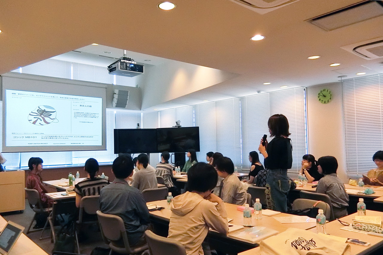
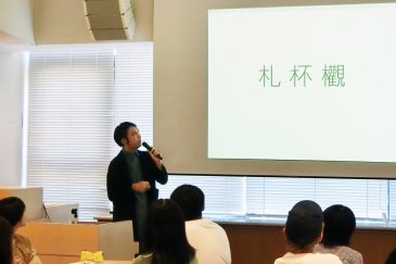
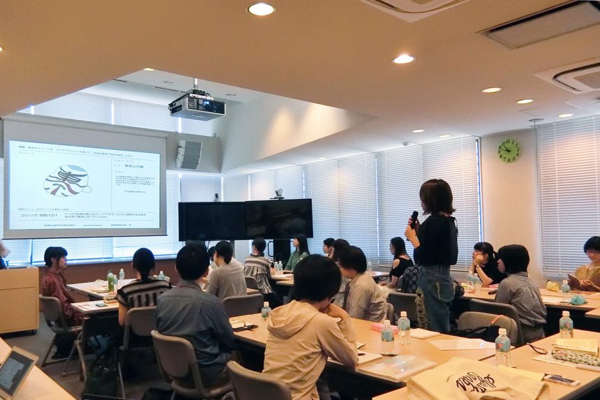
One of the programs for the day was a seminar and workshop led by a font creation professional.
The first speaker isType Bank Co., Ltd.Hiromi Takada, a typeface designer at Morisawa Group, explained that typefaces are created to fit a concept and shared some behind-the-scenes information.
In the photo, the club member is holding the original characters, which were drawn by hand on special graph paper. When drawing, they pay attention not only to the balance of each character, but also to whether they appear to be the same size and darkness when lined up with other characters, even if they have different numbers of strokes or shapes, and whether the tilt and center of gravity are the same.
The hand-drawn typeface is then imported into a computer as data, where it is checked and adjusted. Before it is released as a font, it is again adjusted to take into account the balance with other characters.
What is a director's job and what makes a good typeface?
Next up was Tetsuyoshi Tomita, director of typeface development at Morisawa Inc. A director's job begins with considering the font that should be created based on market research.
After that, while selecting the production team, managing the project, and controlling quality, I was also involved in the work of checking and adjusting the typeface design, as Takada mentioned.
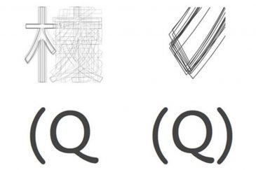
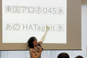
For example, even within the same typeface, the shape of the "ki" radical has been fine-tuned to take balance into consideration. The tail of the "Q" (the second stroke) is also designed with an automatic conversion program in place to ensure that the length varies depending on the adjacent character, taking into account the balance between the characters.
"A typeface can only be called excellent if it is designed to be easy to read and look beautiful when used in text," he said, teaching the club members about the depth of typeface creation.
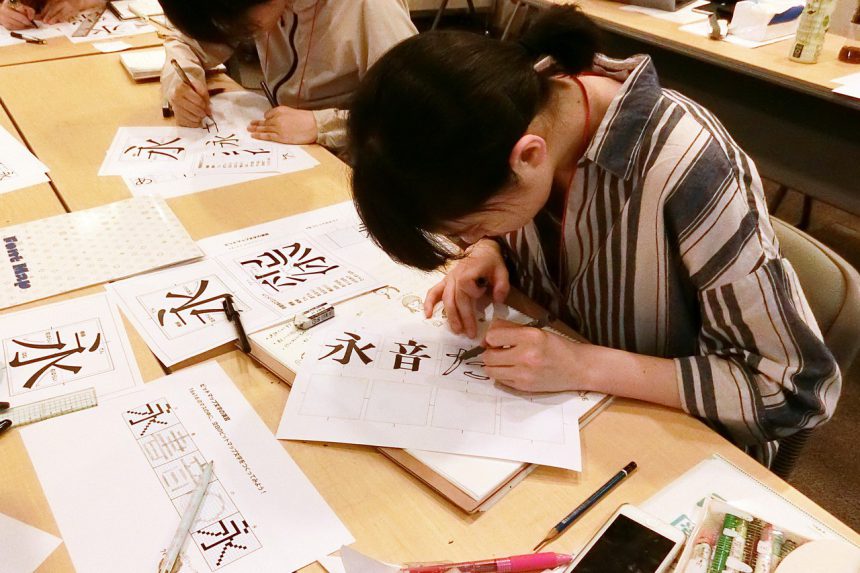
The workshops are also great - learn lettering under the guidance of a professional!
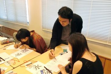
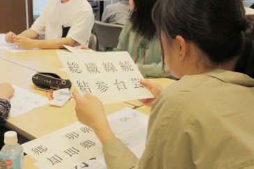
The workshop was a great success thanks to the two of them. Here we see them lettering "永" (eternal), "音" (sound), and "た" (ta) in Mincho font. Of course, after they finished, they gave their comments.
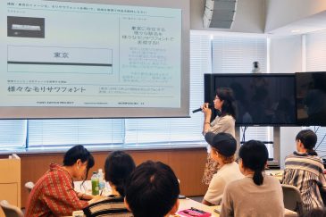
"Pay attention to the balance and unity, as well as the angle of the font. There are angles that look natural in relation to the structure. Please take a look at the angles of various fonts," says Takada.
Everyone,Characteristics of Mincho typefaceorelementPlease refer to the above and give it a try.
Typefaces can last for hundreds of years, which is why creating typefaces is so interesting!
The second meeting ended with great success among the club members, with comments such as, "We don't usually get to meet type professionals," and "It was a rare opportunity to see hand-drawn typefaces!"
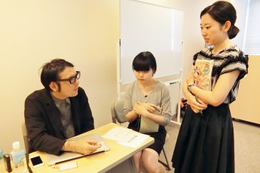
After the meeting, the Eto/Terauchi duo brought some lettering they had done outside of club activities and asked Tomita for advice.
"If you just want to create something unique, it doesn't have to be a typeface. The important thing about typefaces is consistency," says Tomita.
"Typefaces may seem difficult to create because of constraints such as readability and consistency. But on the other hand, they can last for hundreds of years. In fact, there are fonts that were created by digitizing typefaces from a time before computers."
Takada also spoke about the appeal of creating typefaces:
"recent years,UD Digital Textbook FontThis is a textbook font created from the perspective of universal design. It is easy to read even when used in digital teaching materials, and the direction and number of strokes of the dots and strokes are clearly visible, making it easy to use in educational settings where characters are being taught.
It's fascinating to see how society's needs are translated into type. Creating typefaces is a deep and complex subject that I never tire of, even after more than 30 years of experience."
Writer: Umezawa
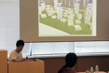
It has been a week since the assignment was given at the first meeting. This time, each person brought their own ideas.
[Task: Typograhy × Tokyo (TOKYO)]
Create a work that expresses the image of Tokyo using typefaces in a free manner.
With the aim of "spreading the beauty of Japanese writing" and "promoting the city where I live to the world," the aim is to create an expression that will evoke the image of "Tokyo" even when seen by people from overseas.
The subject matter can be anything, such as kanji, buildings, landscapes, people, etc. The medium of expression is also free.
Please be sure to include the word "Tokyo" or "TOKYO."
Each presentation was three minutes long. Mori said he developed his idea from the fact that Morisawa fonts are used to display station names, which was mentioned in the previous seminar.
"Tokyo is a city with a diverse range of colors. I created the artwork by changing the font of each station name to match the unique character of the city."
Yajima also noted that each font has its own strengths and weaknesses, and that fonts have compatibility with each other.
"Each font has its own unique personality, just like a human being. That's why I decided to arrange the fonts in the shape of a female silhouette to represent the various women living in Tokyo.
For example, if I were to depict a teenage girl in Shibuya, there would be a font that would suit the words that a girl of that age would use. I think I could convey that character through the typefaces.”
In this way, many members have used the "interestingness of fonts" that they themselves have felt as a source of ideas. Depending on their own themes, they have expressed their ideas in a variety of forms, such as booklets, videos, products, etc.
An encouraging guest, Shimohama Rintaro, appears

As this is still an interim report, there are some voices saying, "I'm still unsure about some things..." This time, we will be providing a strong support to such members.Rintaro Shimohamais now available!
Shimohama, a graduate of Kanazawa College of Art, is a graphic designer who works on a wide range of projects, from posters to exhibition spaces.Unique and original projectsWe are also working on submitting our works to exhibitions and local art festivals.
Along with introducing himself, he also shared with us the behind-the-scenes story of how he created his "Logotype Extension" (the "Delicious Milk" building blocks that became a hot topic on Twitter), which was exhibited at the "Design Anatomy Exhibition" held last year.
This piece has 50 building blocks for the "delicious" part, which can be combined to create milk with any name you like.
The Oishii Gyunyu logo may look like an existing font, but it's actually an original typeface created by designer Taku Sato. Its rounded shape matches the mellow, gentle taste of milk.
In creating the blocks, Shimohama used a 50-syllable font developed by a designer from Taku Sato's office.
Apparently, they created the building blocks by taking molds from actual paper cartons.
The behind-the-scenes stories of professional production will surely inspire and nourish you as you create your assignment!
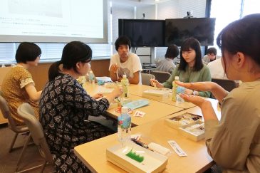
Shimohama-san gave individual advice.
Regarding the club members' presentations, Shimohama said, "The biggest problem was how to include the words 'Tokyo' and 'TOKYO'."
"It's important not to make the viewer wonder, 'Why is the name of a place written here?' I hope the characters 'Tokyo' and 'TOKYO' will appear as a necessity in the work."
During lunchtime, Shimohama joined the group and answered everyone's questions and concerns.
"Shimohama's comments helped us see areas for improvement!" and "We might end up changing quite a bit," said the club members. The final presentation of the project will be at the next club meeting... How will the club members show us the "charm of fonts and Tokyo"?
Writer: Umezawa