
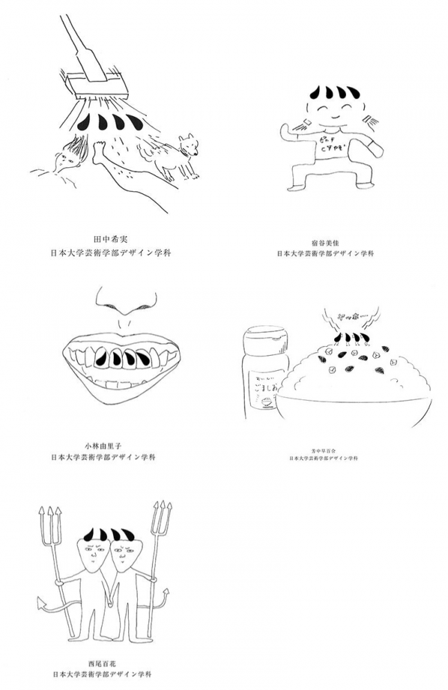
I was interested in the interesting "shapes" of the letters, and came up with a project to have my friends who aspire to be creators draw pictures using some of the fonts.
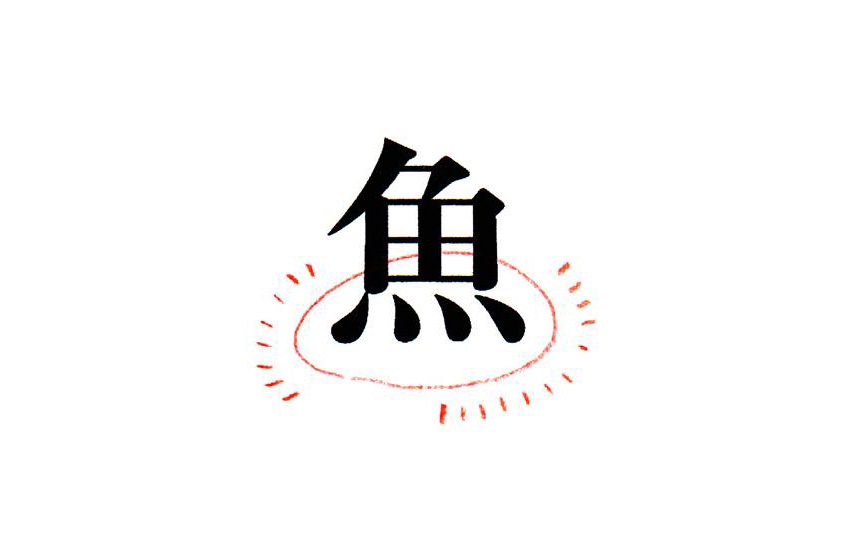
The subject of this issue is the radical of the Chinese character, "Renga" dot.
I thought it was just a dot, but it has given rise to many different ways of looking at it. The idea of making it look like the devil's horns is brilliant.
The font used is "Ryumin B-KL (included in MORISAWA PASSPORT Academic Edition). It is a typeface with exquisite balance and soft beauty.
Generally, fonts are used as a means of expressing words, but even a single part of a letter has its own charm. Looking at a typeface from a different angle, you may discover something new.
(Contact: Anli Lu, Molypus Department)
This project is being handled by the official student members of the FONT SWITCH PROJECT, the "Moripass Club" students.