
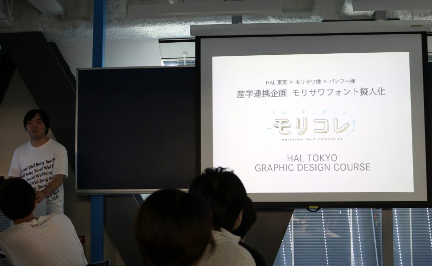
A collaborative project with HAL Tokyo Vocational School, Hokaze Co., Ltd., and Morisawa Inc. began in the spring of 2018.
The theme was "Proposing a promotional tool for the Academic Edition of MORISAWA PASSPORT by personifying (characterizing) Morisawa fonts." The idea was to use characters that are easy to understand even for students who are not very familiar with fonts, in an attempt to "turn on" the sensitivity of fonts.
The teams that propose excellent promotional tools will be able to turn them into reality with the cooperation of Hokaze Co., Ltd.!
First, Morisawa staff explained the objectives of the assignment and taught them how to research the background and characteristics of fonts. Then, Hokaze staff gave a lecture on printing technology, and the participants were asked to think about what kind of tools they would create and how to use them effectively.
At the mid-term presentations, each participant presented a unique proposal that was full of ingenuity. The participants were surprised by the fresh ideas that exceeded their expectations, and asked a variety of questions and offered advice.
"Is the character design clear to the viewer that this character is in this font?"
"Can you use this tool to promote sales?"
"If that's your goal, maybe this font would be more suitable?"
One team later asked questions, saying that they wanted to know more about the history and background of characters when they were personifying them.
The final announcement has finally arrived.
Everyone looked nervous as they showed off their accomplishments.
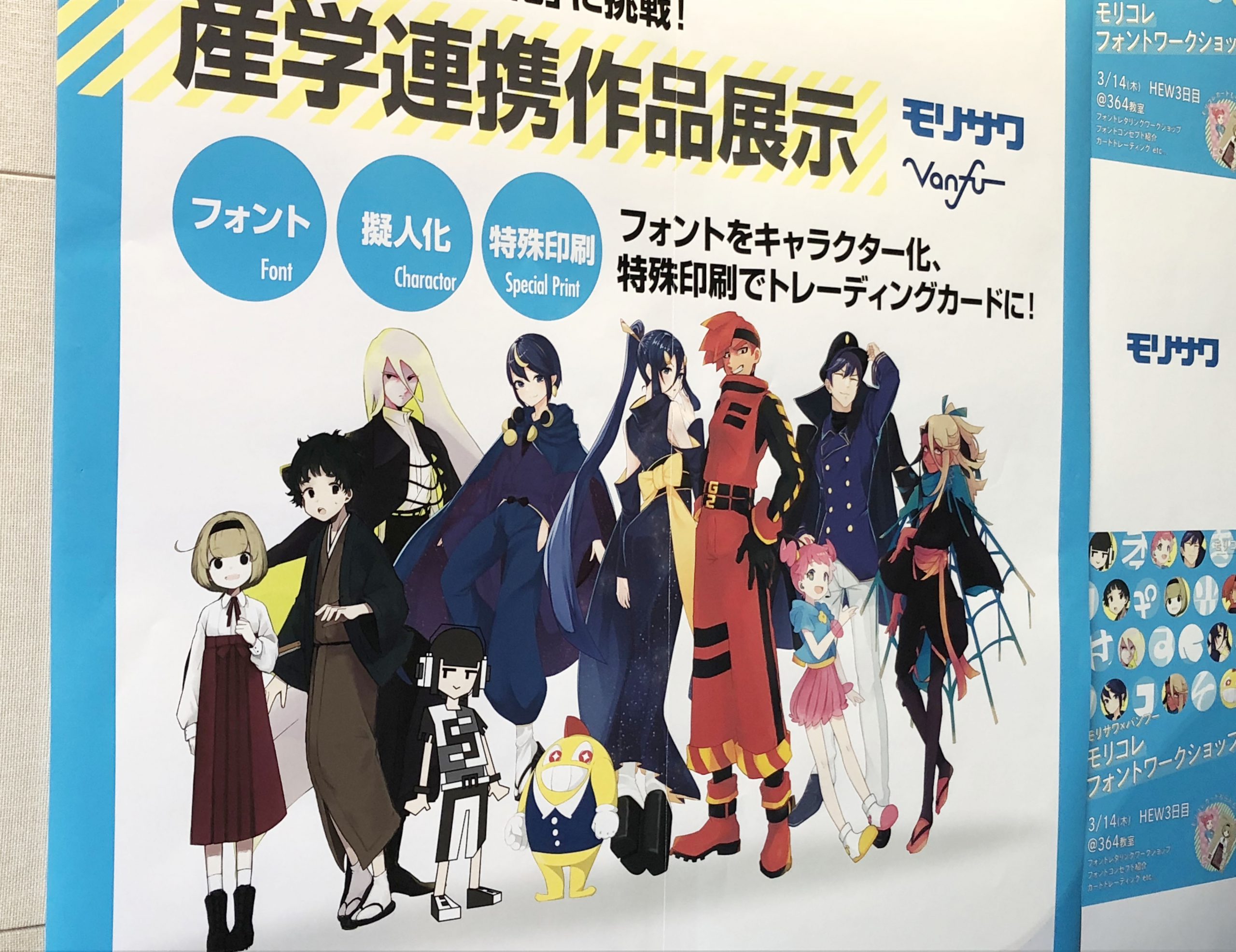
Using the motif that Morisawa fonts are "created by hand from graph paper (drawing paper)," the team proposed to develop experiential advertising using wall advertisements on train stations and trick art, and to distribute cute character goods.
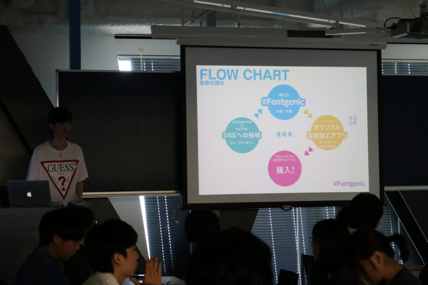
This team proposed a tool based on the theme of Fontgenic, rather than Photogenic, that allows users to take photos with characters and share them with friends.
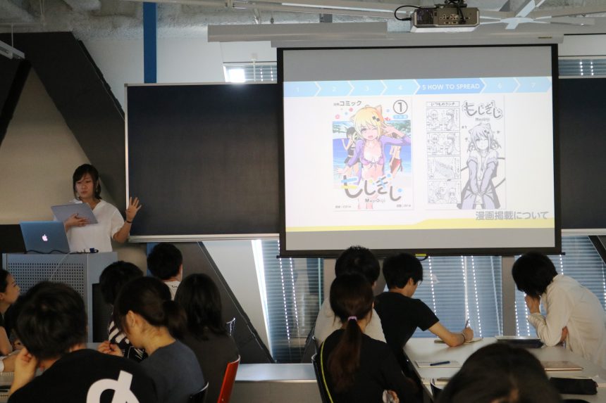
The team proposed a way to spark interest in fonts through a fascinating story featuring personified characters using simple Gothic fonts, elegant brush strokes, and cute design fonts.
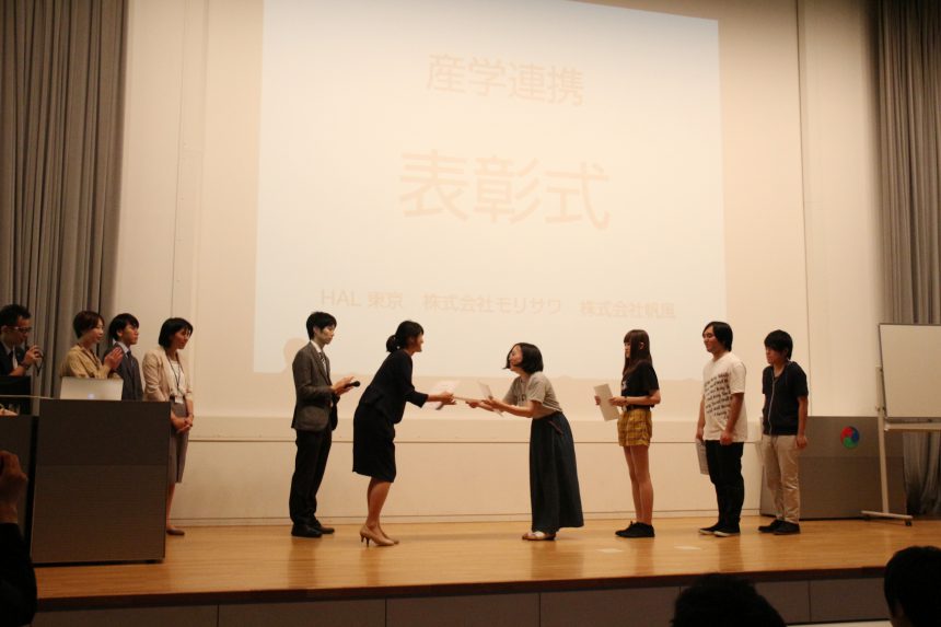
After further judging, the team that proposed "MoriColle" was awarded both the Morisawa Award and the Hokaze Award!
First, the team conducted a survey of target students to analyze the reasons why they did not own the fonts. They then suggested that we raise awareness by introducing the wide variety of typefaces included in the Morisawa Passport Academic Edition.
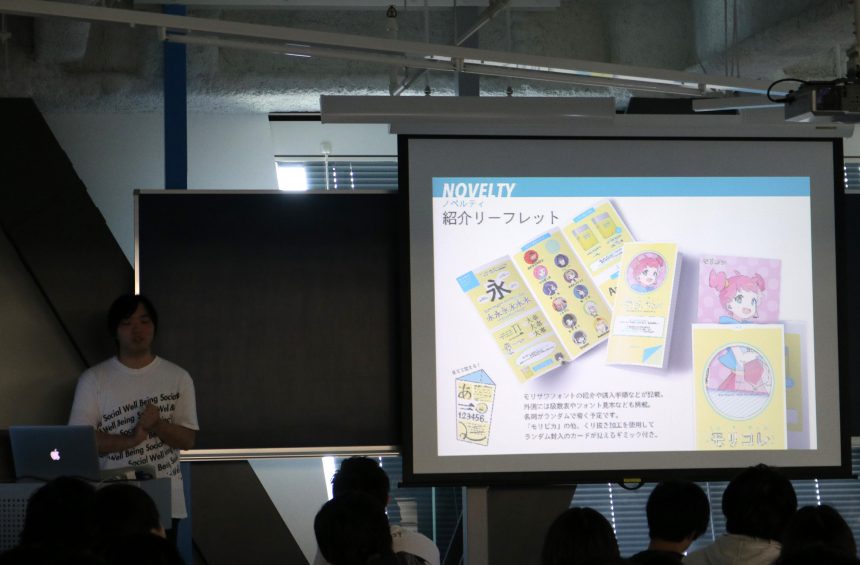
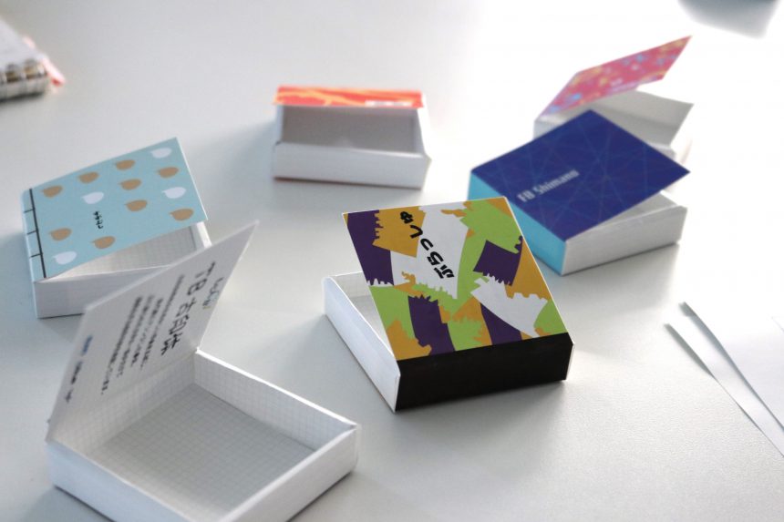
The tools used are character cards and leaflets. For cards, we used "MoriPica" is used to create a piece that you'll want to collect. The leaflet is designed so that you can learn not only about the characters but also about the font.
We will now move forward with making MoriColle a reality! In the next issue, we will publish an interview with the team after they won the award. Please look forward to it!
A collaborative project with HAL Tokyo Vocational School, Hokaze Co., Ltd., and Morisawa Inc. began in the spring of 2018.
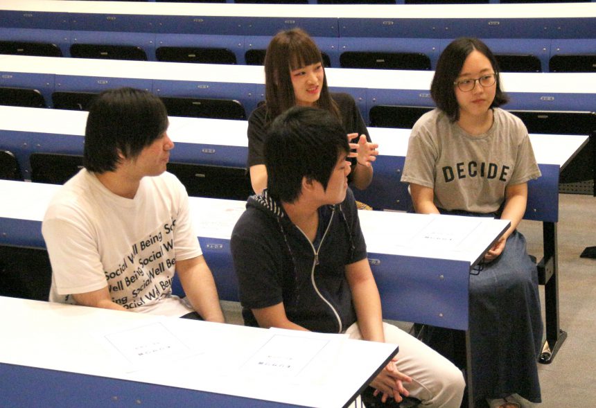
In the previous article, we covered the events leading up to the award ceremony. In this article, we will focus on the team that proposed MoriColle, which won both the Grand Prize and the Hokaze Award.
While all the teams put a lot of effort into their designs, the deciding factor in their evaluation was that it was clear why they chose this font over this character design, and that they created a flow that used the character as a starting point to get people interested in the font.
Another reason for the high evaluation was the consistency of the story, from research, target setting, problem definition, characterization, to proposing a tool to solve the problem.
It was actually this team that asked us questions about the history of the characters. The secret to the charming characters lies in meticulous research into fonts.
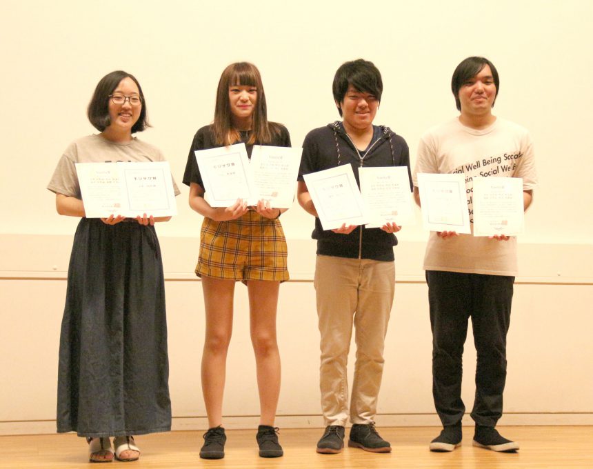
MoriColle team (from left in the photo: Dote Chika, Murakami Natsumi, Shiode Takeshi, Nishizato Amao)
Interview with the best team!
Q. How did you decide on the font you chose for the personification this time?
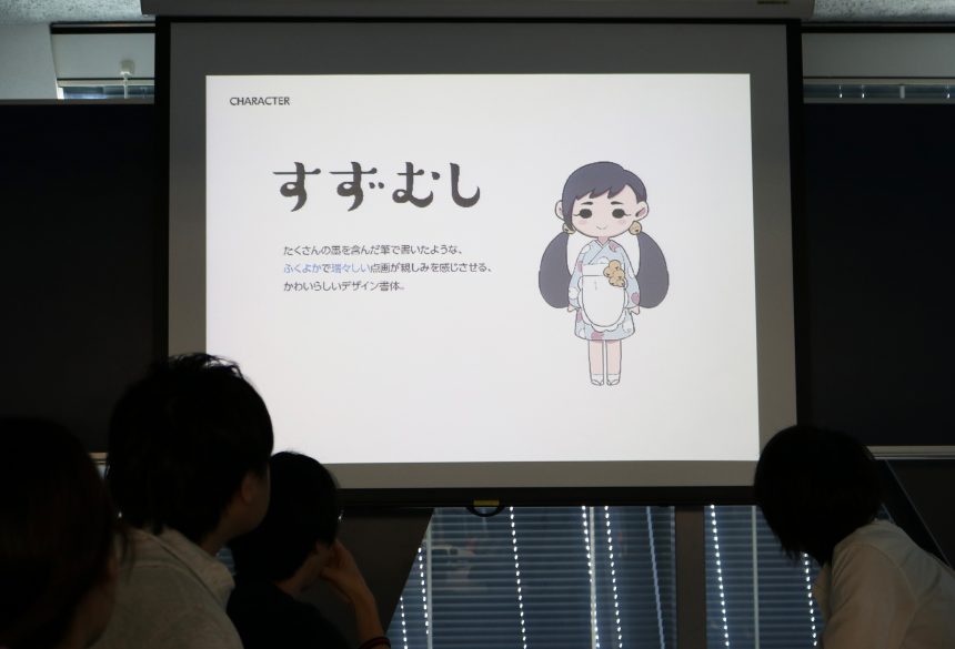
We chose 11 fonts (from Gothic, Maru Gothic, Mincho, Western fonts, and design fonts) from our favorite fonts that have memorable characteristics and balance.Lalapop,Shuei Maru Gothic,Kaimin Sora,Kaimin Moon,Kumoyaji,Suzumuri,G2 Sans Serif,fork,Mitsucho,Rubberblade,FB Shimano) was chosen.
Q. How did you come up with these fascinating characters?
Each member of the team worked on designing character illustrations based on the characteristics of the typeface. We looked not only at the appearance, but also at the Morisawa website, and utilized the concept of the typeface, such as turning "Suzumushi," which has a worldview of rakugo, into a rakugo performer character.
Q. Has anything changed for you as a result of working on this project?
"It made me want to learn more about fonts!"
"Learning how fonts are made changed my perspective on fonts."
"When I looked at the font, I began to imagine what the character would be like if it were personified."
By analyzing the characteristics of the font and designing the characters, everyone seemed to feel more familiar with the font itself!
In subsequent meetings, with the cooperation of Hokaze Co., Ltd., it was decided that the "leaflet" and "trading cards" from this project would be realized.
And since we're actually going to create trading cards, we want students to experience trading (exchanging) cards, not just hand them out!
...And so, we have been given the special opportunity to exhibit at a booth at HAL Tokyo's promotion exhibition (HAL EVENT WEEK) in March.
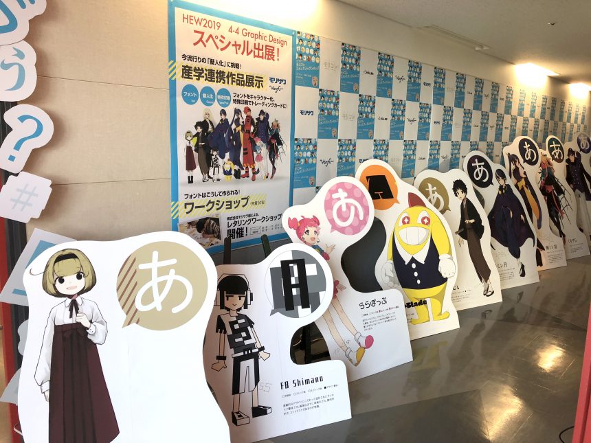
Thanks to the hard work of the MoriColle team, the event was decorated with MoriColle character goods such as life-size POPs, badges, and postcards.
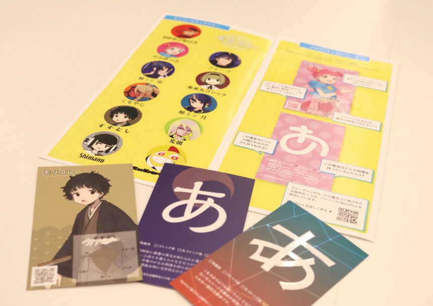
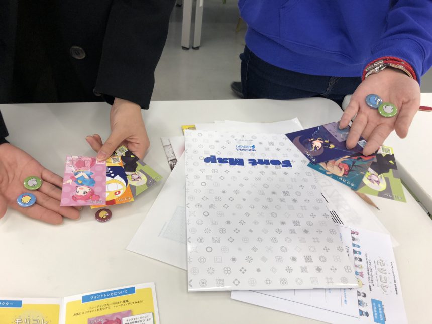
Of course, the main focus of this issue is the trading cards, and the leaflet that provides information on how to read the cards and how the fonts are created is also beautifully produced.
Hokaze Co., Ltd.'s "MoriPicaThe raised varnish finish on the " " also adds to the card's appeal!
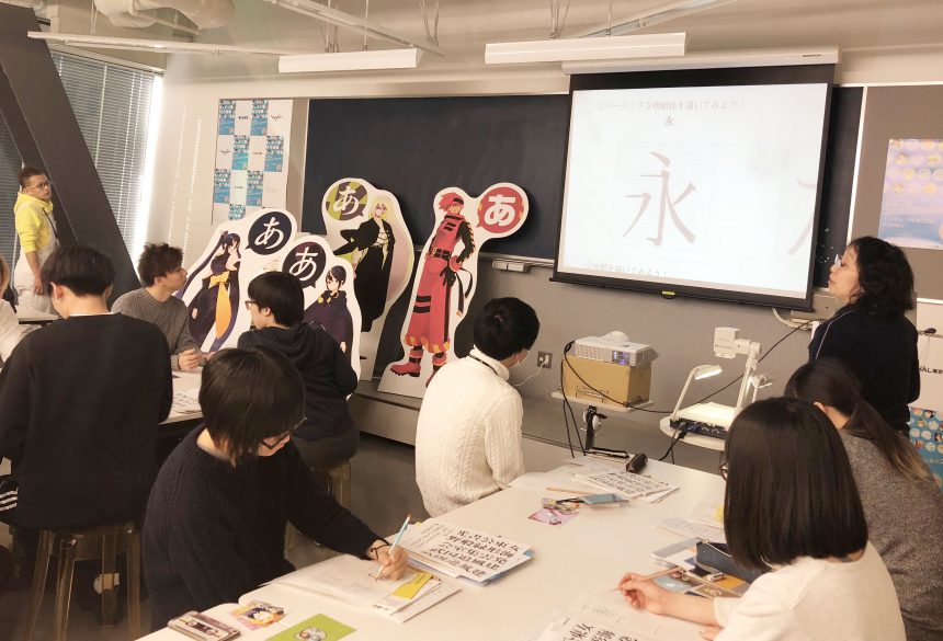
In addition to card trading, the event also included a lettering workshop taught by a Morisawa typeface designer, where participants could actually try writing letters.
First, in the lecture, you will learn about the difference between Mincho and Gothic fonts, that when designing a typeface, you first draw the skeleton and then add details, and that there are various types of Mincho and Gothic fonts.In the lettering workshop, you will actually draw letters with your hands, and develop an eye for handwritten fonts.
When the long-awaited trading time finally began, exchanges began with people saying, "I want this character's card!", and the time became very harmonious.
It was impressive to see how the participating students had fun while deepening their knowledge of fonts by using the charming characters as a starting point.
I think this event helped turn on the font sensibilities of not only the MoriColle team, but all the participants as well.
Thank you to everyone at HAL Tokyo!