

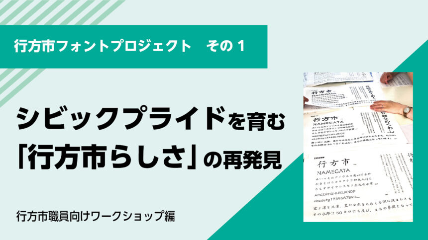
To commemorate the 20th anniversary of the establishment of the city, Namegata City in Ibaraki Prefecture is collaborating with Morisawa to select a new font for its city. Candidates were selected through workshops held between Namegata City officials and elementary school students in July and August 2025, and the new font was selected in September 2025 through a vote by junior high school students.
The "established font" will be used in government communications such as public relations materials and business cards, and will be one of the brand elements that will demonstrate Namegata City's uniqueness both domestically and internationally. This article reports on the "Workshop for City Employees," the first part of the project.
[Namegata City Font Project Decision Process]
- Workshop for city officials (July): City officials consider what makes Namegata City unique and consider candidate typefaces.
- Workshop for elementary school students (August): Elementary school students in Namegata City learn about character design and hold a mock vote from candidate typefaces.
- Voting by junior high school students (September): The official font was decided by voting among junior high school students in the city.
Towards the selection of the "Namegata City Font"
A "designated font" is a powerful tool for unifying an organization's identity and conveying a consistent image to the outside world. Namegata City's efforts were not simply about selecting a font. The use of unified fonts is also attracting attention in cities around the world (such as Chicago and Dubai) as an effort to foster civic pride.The true purpose of this project was to put into words what makes Namegata City unique and to build a foundation for sustainable brand management that each and every employee could agree on.
[Namegata CityFor staffEstablished Font Workshop】
Part 1: Document design that communicates with the audience and the role of fonts
- The relationship between branding and fonts: Towards a font design project
- Creating clear announcements: The difference between communicating and being understood
- How to choose a font
Part 2: Building a foundation for using established fonts with confidence
- What is Namegata City's "characteristics"?
- Consider actions to achieve the results you want
Part 1: Document design that communicates with the audience and the role of fonts
Namegata City faced challenges such as low interest in the local area among young people and the difficulty of communicating information to residents. As part of city promotion efforts, we proposed that the city "establish a 'city font' as a measure involving residents," which was approved by the city council and was then implemented.
By considering "What font should be the city's font?" along with the theme of "What would Namegata City be like in the future," we aim to ensure that Namegata City employees are satisfied with the font and that residents can perceive the "Namegata City identity" from the typeface.
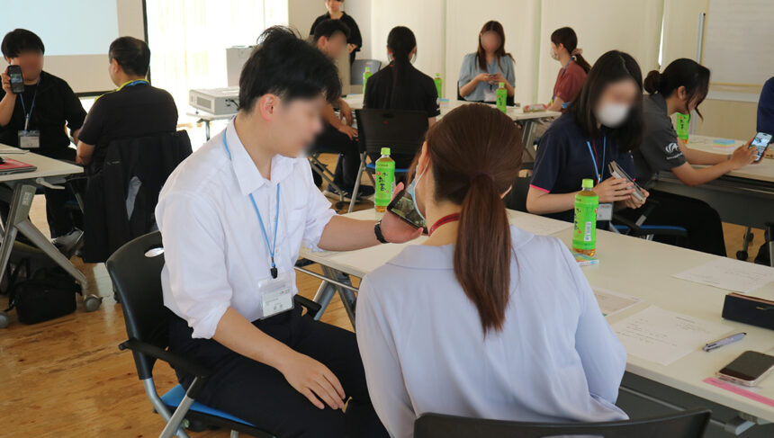
The morning session started with a "self-introduction workshop" with the person next to you. The first session was "words only," and the second session was "photos and words," allowing participants to experience the differences in how information is conveyed.
It's not easy to get people to know you in a limited amount of time, but if you think about how to communicate, it becomes much easier. The same goes for information dissemination by local governments, and we shared that how you communicate determines how well people understand you.
The relationship between branding and fonts: Towards a font design project
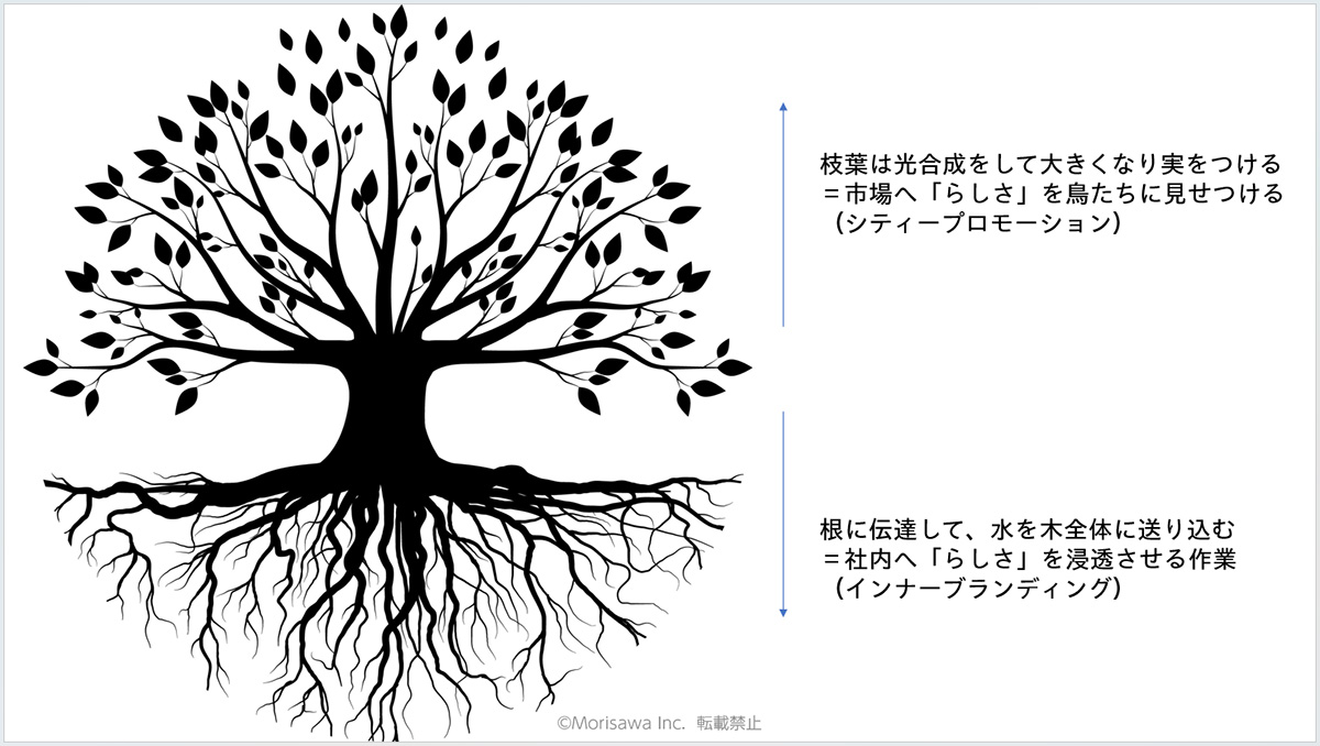
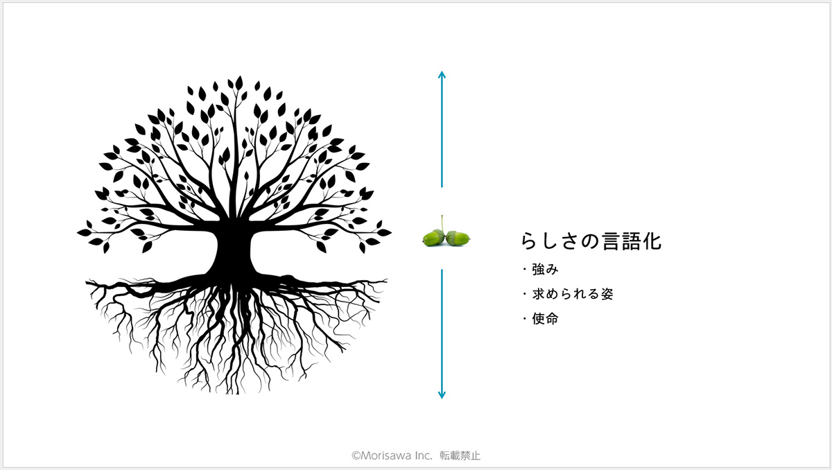
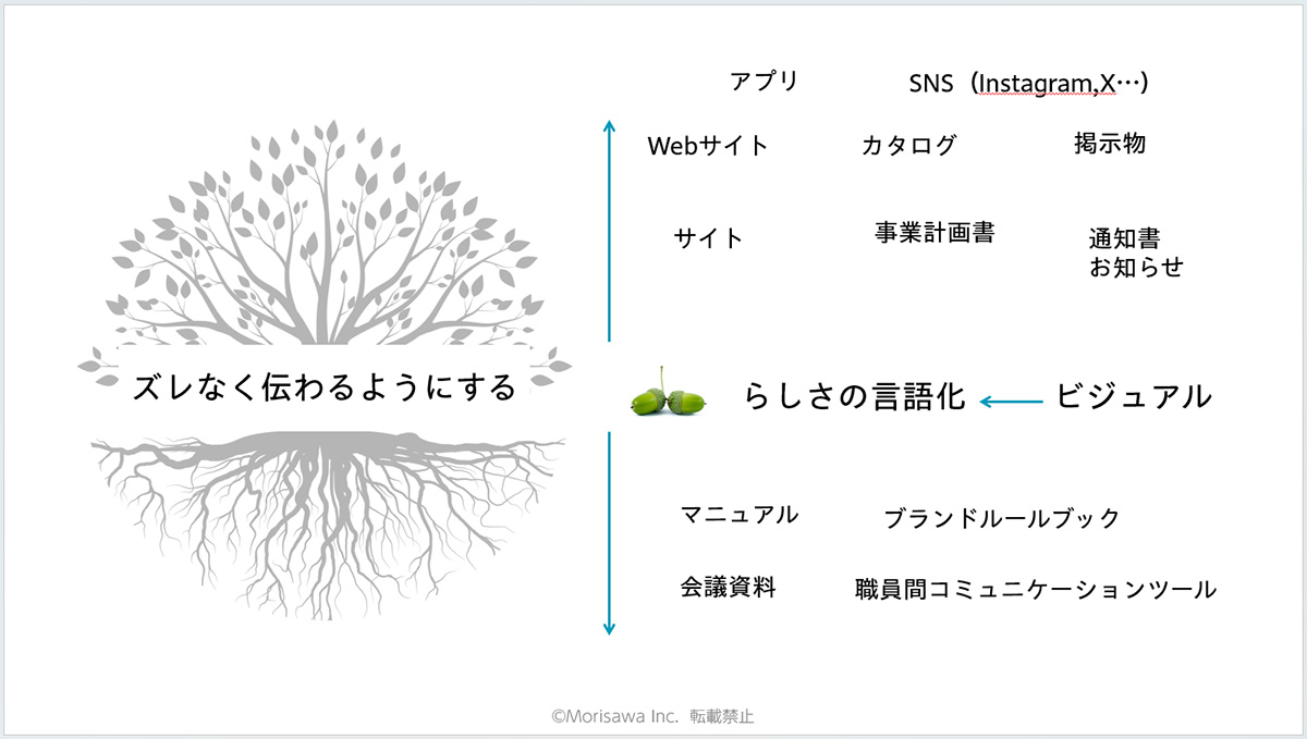
To help you understand why a "designated font" is necessary, we first talked about the concept of branding.
If we compare branding to a tree, the genes contained in the seeds, or the unwavering will, can be said to be "uniqueness." However, in order for that to take root and grow branches and leaves, it is essential to "verbalize that uniqueness." In the case of local governments, this means being able to clearly talk about their strengths and mission. Then, by implementing both internal branding, which penetrates the organization so that the roots take deep roots, and city promotion, which communicates so that the branches and leaves grow outward, the tree will grow large.
The designated font plays an important role here. Using a consistent font across all internal and external communication activities, such as meeting materials and manuals used by staff, and city newsletters and websites viewed by citizens, will help to establish a "Namegata City identity."
Creating clear announcements: The difference between communicating and being understood
When people obtain information, they*In this section, we have presented some data to explain the difference between "communicate" and "communicate."
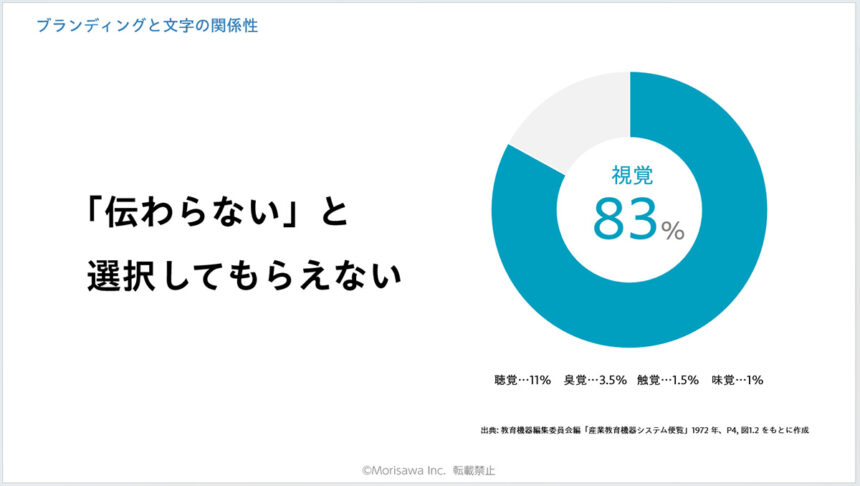
For example, a flyer announcing a seminar. The purpose is to get people to attend, but before that there are the stages of getting them interested and learning more. However, people only have a few seconds to look at a poster, and in that time they can only comprehend around 15 characters. Therefore, rather than "communicating" information uniformly according to the sender's standards, it is essential to have a design that "communicates" information in a way that takes into account the receiver's priorities.
When we hear the word "design," we often hear people say, "I can't do it because I don't have any sense for it."However, the main elements are "text," "color," and "shapes," and in general documents, text accounts for 60 to 80 percent.In other words, simply arranging the text information can result in a page that is easy to understand. Here, we used the subject of a "flyer that doesn't get the message across" to identify the problems, and then explained specific points for improvement.
- The title has decorative letters that make it difficult to read
- The event summary is unnecessary for the recipient
- Half-width and full-width characters are mixed together, making the characters look uneven.
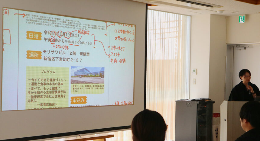
[Key points for creating clear announcements]
- Organizing and prioritizing information
With the "interest → understanding → action" sequence in mind, the benefits to the recipient are placed at the top.
- Separating information to be seen from information to be read
Priorities will become clear if the top 70% of the page is "information to be seen" and the bottom 30% is "information to be read."
- Line spacing and beginning alignment
The margins between lines (line spacing) and the beginnings of bulleted lists and other text are aligned to make the text easier to read.
- Use font size and weight (thickness of font)
Increasing the ratio of the headline size to the body text (the "jump rate") creates a "popular/youthful" impression, while decreasing it creates an "intellectual/trustworthy" impression. Also, using bolder weights for information you want to show and thinner weights for information you want people to read creates a sense of contrast.
How to choose a font
Finally, we introduced the two roles of fonts.
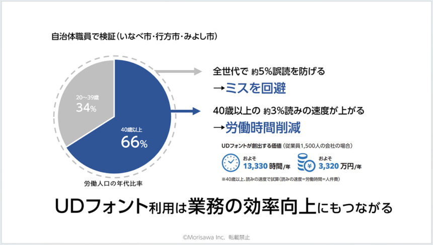
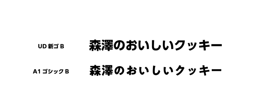
One is "transmitting information correctly." For example, Morisawa's UD font was developed based on the concepts of "character shapes that are easy to understand," "sentences that are easy to read," and "difficult to misread."
In a test conducted with the cooperation of Namegata City officials, it was confirmed that the use of UD fonts prevented misreadings by approximately 5% and improved reading speed by approximately 3%, and they praised it as "leading to improved work efficiency."
The other is that it conveys nuances and images. Typefaces have a "skeleton" that corresponds to the bones of a human body, and "elements" that give flesh to them, so even the same Gothic font can give a different impression.Rounded fonts convey a sense of softness and friendliness, while straight fonts convey a sense of reliability and intelligence.We concluded the first part by explaining that by understanding these characteristics and choosing the appropriate font, the ``Namegata City identity'' will be spread both inside and outside the city, leading to the development of civic pride.
Part 2: Building a foundation for using established fonts with confidence
In the afternoon session, a more practical workshop was held with the goal of enabling each staff member to describe in their own words what a "font that is characteristic of Namegata City" would be.
What is the "characteristic" side of Namegata City?
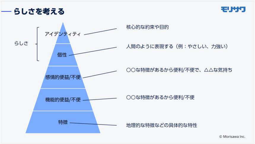
Next, a workshop was held using the "Brand Pyramid" to gradually verbalize what makes Namegata City unique. Participants were divided into groups based on their generation - "children and students," "people in their 20s and 30s," "people in their 40s and 50s," and "people over 60" - and asked to discuss Namegata City's "characteristics" and "functional benefits/inconveniences."
While each group voiced opinions such as "the area is rich in nature," "there is a culture of sharing rice and vegetables," and "there are many places to play with children," there were also more realistic opinions such as "there is poor transportation" and "there are few medical facilities," reflecting the generational consciousness.
Furthermore, when we asked them to discuss the emotional benefits/inconveniences arising from the features and functions, although some negative opinions were expressed, it also provided an opportunity to find a common sense of what makes Namegata City unique, such as "fun" and "heartwarming." By imagining this "future image of Namegata City," it became clear which parts they wanted to cherish. As they rediscovered this as the "uniqueness of Namegata City that they want to preserve for the future," they began the "action" work.
Consider actions to achieve the results you want
The established font is an important element of branding. However, unlike changes to the logo or packaging, it will be gradually disseminated through city newsletters, pamphlets, etc.We shared the possibility that long-term value could be created in the future, such as "children who grew up using the designated font seeing it in another area and being reminded of Namegata City."
In the final group work, participants were assigned to stakeholders such as residents, tourists, students, and government officials, and were then asked to think about "where they will encounter fonts" and "how the impression of a font will affect their actions and decisions," and then select candidates for the designated font from among 35 typefaces.
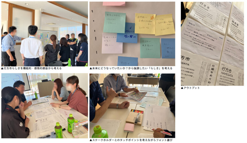
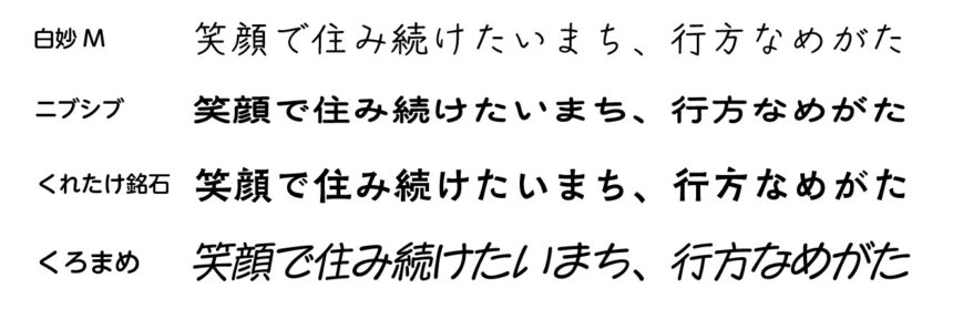
- Group A:We selected "Shirotae M" as a font for residents. When we envisioned its use in city newsletters and notices, we felt that the font's warmth and ease of reading were its merits.
- Group B:We chose "Nibusibu" as a target for tourists with children. Considering the tourist brochure, we thought that the rounded and warm atmosphere would match the character of Namegata City.
- Group C:The "Kuretake Meiseki" was selected for students. The "'chon' part of the kanji character" resembles Mount Tsukuba and sailing ships, so we thought it would convey the joy of Namegata City.
- Group D:We selected "Kuromame" as the font for administrative staff. The free-flowing nature of Namegata City matches the impression of the font. We thought it would express the city's abundant nature and help promote tourism.
Selecting a designated font fosters attachment and pride
Finally, Mayor Namegata said, "Thinking about how to convey the city's thoughts through fonts is extremely important in helping residents and people from outside the city understand the appeal of Namegata. Selecting the official font will be a process of fostering attachment to and pride in the city."
The workshop for city officials was held in July, followed by a font workshop for elementary school students in Namegata in August, and then in September the "Namegata City Typeface" was selected by a vote of middle school students in the city. With the goal of fostering civic pride, what typeface was chosen?
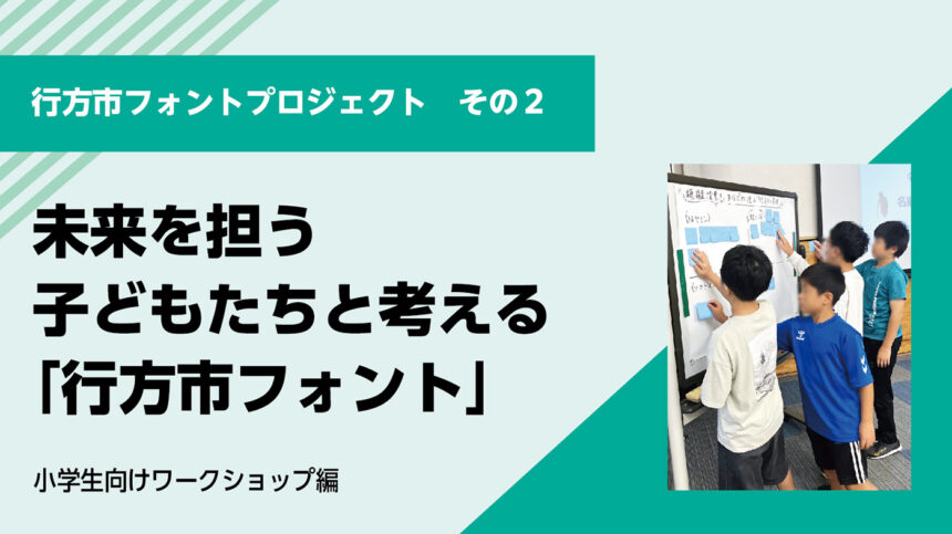
Next, we held a workshop on fonts for elementary school students in Namegata City. What did we talk about?
⇒Continue to Part 2: Workshop for elementary school students
Morisawa offers the first part of the training on document creation in a face-to-face format as a "Document Design Program that Communicates" for local governments, schools, and general companies.
Further details (including costs, schedule, and participant testimonials) can be downloaded for free here.
If you are interested in the "Communicative Document Design Program," the UD font used in the training session, or the "Established Font," or if you are considering introducing or utilizing it, please feel free to contact us using the information below.
● If you want to use UD fonts as an organization, we recommend the "MORISAWA BIZ+ UD Font Plan for Public Organizations." For details of the plan,Here