『WASEDA LINKS vol.36' has been released on the e-book site "Katapoke."
The theme is "Choose"! Be sure to check it out.
『WASEDA LINKS vol.36Read " on Katapoke
KatapokeWhat is it?
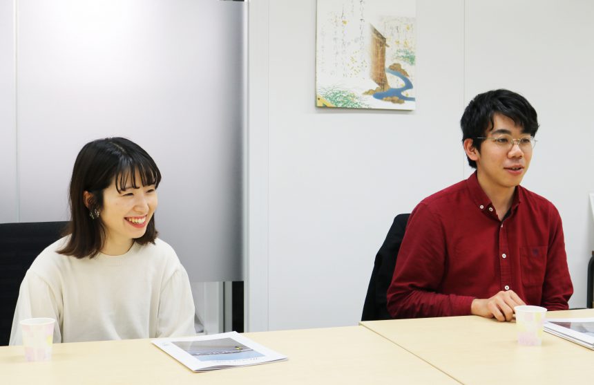
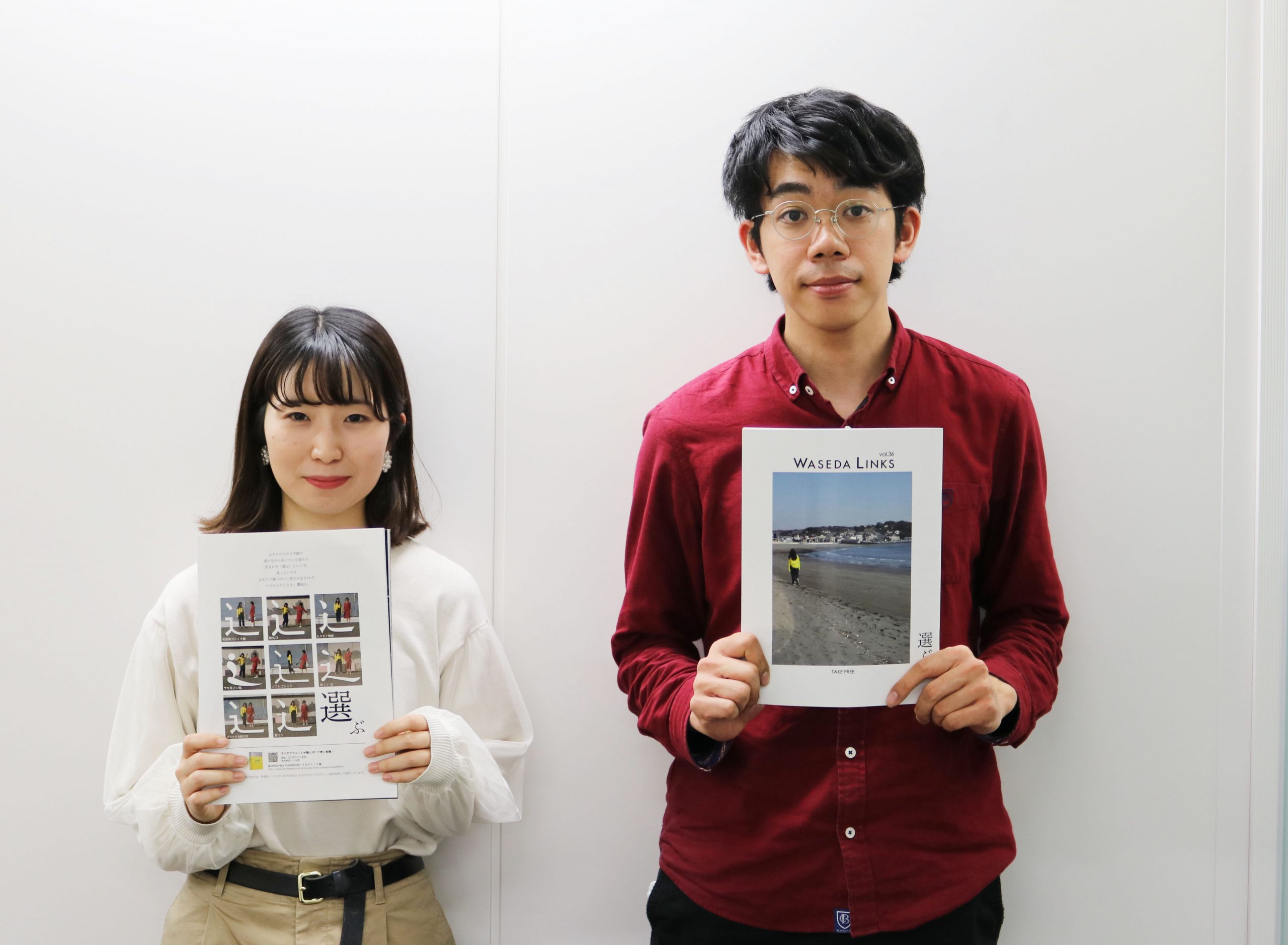
This issue focuses on the act of "choosing," which sometimes causes us great worry and sometimes occurs unconsciously in our lives.1We spoke to the editor-in-chief, Yoshida-san (pictured right), and Nakagawa-san (pictured left), who was in charge of page editing, about their feelings towards this issue and the production of Morisawa's advertising pages.
This time, the text typeface is "Hidehide Mincho" is the reason why I chose this issue. The reason is that I wanted to make it a volume that would be worth reading, like a paperback. I kept the number of pages to a minimum compared to the usual issues. I was conscious of keeping the layout clean, so I hope that readers will enjoy reading it like they would a book.
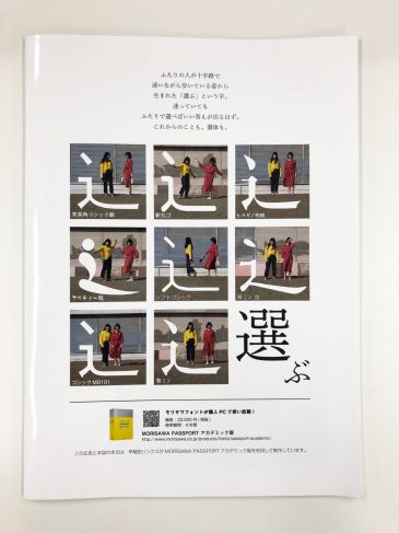
When I started working on Morisawa's advertising pages, the first thing I noticed was that I didn't know the origin of the kanji character for "select." When I looked into it, I found out that it was created from the image of two people walking unsure at a crossroads.
For this issue, I wanted to use a photo on the cover, so I used a photo that was consistent with the cover. I picked out the "shinnyo" characters in several fonts, and for the "巽" part,2I thought I could express this through photographs of girls.
You can choose a typeface depending on the image you want to express. If you look closely, you'll see that even the same character has different shapes depending on the typeface, and each typeface has a different expression, so I wanted to express this, so I chose a photo that matched the impression I got from the typeface. For example,Pretty Peach" gives a rhythmic and lively impression,2It looks like people are dancing happily. I hope that readers will also be able to experience the expanded expressive power that can be achieved by "choosing" a typeface.

『WASEDA LINKSThe next issue of " is already underway. What kind of book will it be? Stay tuned!
Waseda Links Official Twitter ▶︎ @wasedalinks


