

Introducing each of our wonderful members one by one [Moripass Club Member Introduction].
This time, Moripass Club advisor Suda will be sharing the story!
This time, we'll focus on the Moripass members!
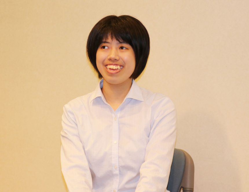
Konomi Tokunaga.
Tokyo Zokei University, Faculty of Art and Design, Department of Design, Media Design major, 3rd year
My favorite typeface is "Kaimin Sora".
We asked Tokunaga to create a piece based on this theme!
Tokyo × Typography
concept
Tokunaga created a dynamic website based on the theme, "What does 'Tokyo' mean to people in their 20s?"
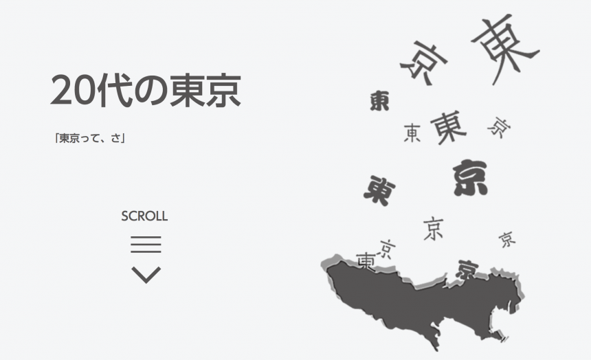
After seeing the works of Moripass members and listening to the images of "Tokyo" of people around him, Tokunaga realized that there are as many images of "Tokyo" as there are people.
He was inspired by this and decided to create a website with the theme of "Tokyo as seen by people in their 20s." He said he chose the 20s theme because he wanted to create something that would appeal to students of his generation.
Pay attention to the "movement" of the font!
The most difficult part was combining web animation with fonts.
When they tried moving it, it seemed that even with the same movement, some movements worked better than others depending on the font chosen.
for example"Hiragino Square GothicA crisp font like " looks great with its straight vertical and horizontal movements, but the loose, sloppy movements give the impression of being unfocused.
"Through trial and error, we were able to find a good fit between the animation and the font," he said. This is a unique perspective from Tokunaga, who normally studies media design at university!
The moment when the font's sensitivity is turned on
This time, Tokunaga-san was asked to use the web font serviceTypeSquareThey used the font to express their comments. When choosing a font for their comment, they said that their font sensitivity was "ON." They found it interesting that the same comment could have a completely different impression depending on the typeface.
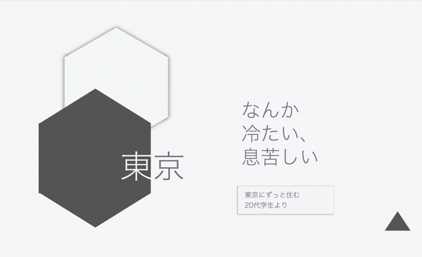
For example, in response to a comment like "It's cold and stuffy," you can use the sharp and impersonal "Hiragino Square Gothic" to create a cold-looking atmosphere.
The comment "There are a lot of strange things, aren't there?" was accompanied by humorous expressions such as "Bunkara" and "People People People."sweatThe comment "People, hug" is accompanied by a condensed font that looks like it has been crushed during rush hour commutes.UD Shingo Condensed 60" was chosen.
Also, the ones I chose for the top and footer are:UD Shingo" He felt that the font, which is conscious of universal design, could express a neutrality that does not belong to any particular opinion.
*TypeSquare allows you to select fonts that are not included in MORISAWA PASSPORT. "Bankara" is a font that can only be used with TypeSquare.
from now on
This was Tokunaga's first time creating a website using web fonts.
I learned how to create websites that utilize the communication power of fonts, so I would like to use what I learned to continue creating works using web fonts in the future.
He also said some encouraging things, saying that he would like to add more content to improve this work and try to express "Tokyo" using more different typefaces!
Tokunaga-san also played an important role as a core member of the team at the recent event "Workshop & Talk Show Jiyu Jizai." We hope that he will use his experience in the Moripass Club in his future productions!