
There are many different types of fonts, each with its own unique look. In this project, we will compare the look of characters by drawing "Henohenomohe" (ji) = "Henohenomohe character" in various fonts. (The "ji" has been omitted.)
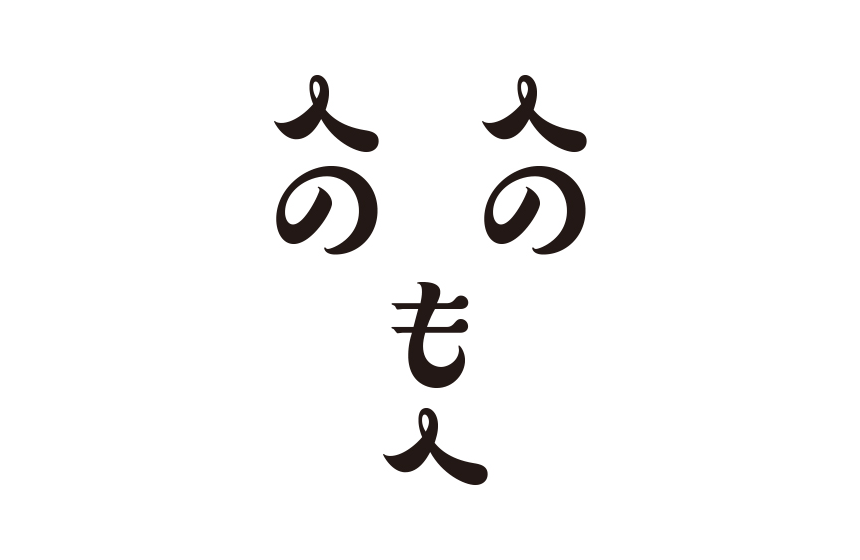
The first font is "A1 Mincho," an old-style Mincho font that has been loved since Morisawa's early days.
The "Henohenomohe" character, created in "A1 Mincho," resembles a serious young man. Its relaxed, elegant curves are more reminiscent of the Showa era than modern times, and it also gives the impression of a pensive gaze into the distance.
Is he deep in thought? Perhaps he is thinking about something difficult. His handwriting was cool and intellectual.
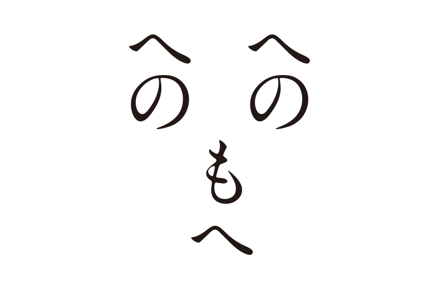
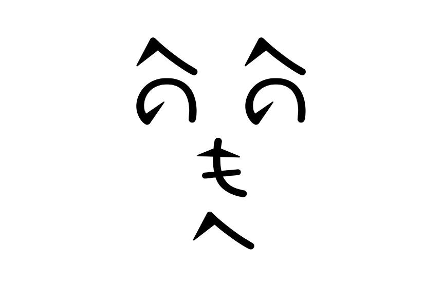
The second font is "Shin Go," a modern Gothic font with a systematic feel.
Was he surprised by something? His face looks a little surprised. He's surprised, but also seems very interested. He may be more curious than most people.
I once saw a celebrity in private in Shibuya and ended up making this face. It's a very impactful expression that only a Shin-Go can make.
The third one is the design font "Suzumushi."
The design is large and filled with ink, and has linear elements within its plumpness, giving it a cute impression without being too old-fashioned.
Compared to the previous "Shin Go" and the previous "A1 Mincho", this is a very charming "Henohenomohe" character. The stop and stroke of the "no" character evoke a woman's curled eyelashes.
It looks like she's just glancing at someone she likes. She may be a shy girl. Her handwriting is so silly it seems like something you'd see in a shojo manga.
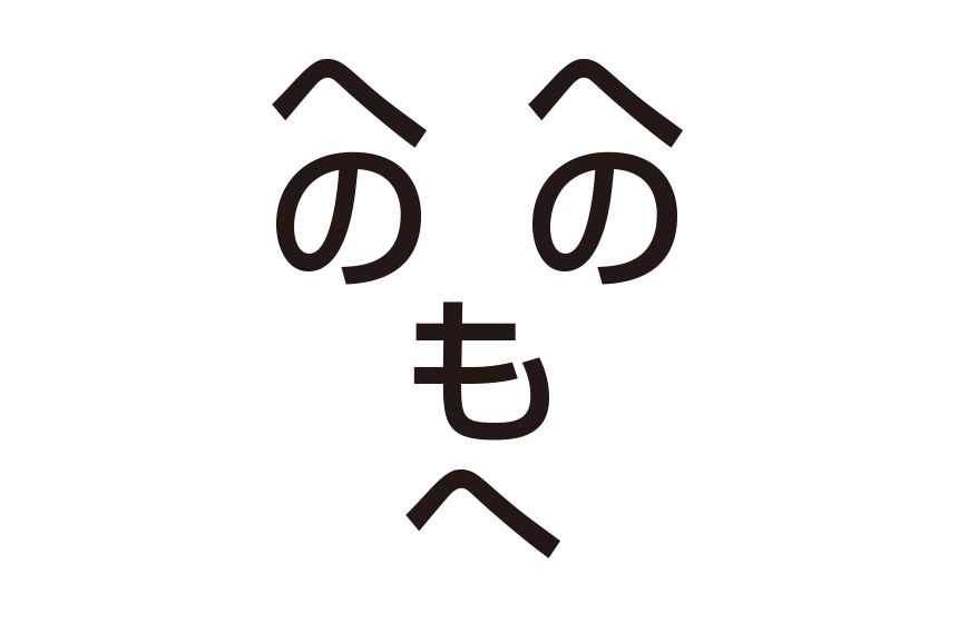
The fourth installment is "Kanteiryu," a design that captures the bold and spirited sensibility of Edo Kabuki.
It looks somewhat lewd. Perhaps it's because the design of the character "no" makes you imagine a grinning eye. Perhaps he found a cute girl at a bar? I often see men like this in Ameyoko, Ueno. It was a "henohenomohe" character that looked like he'd be happily drunk at a downtown bar.
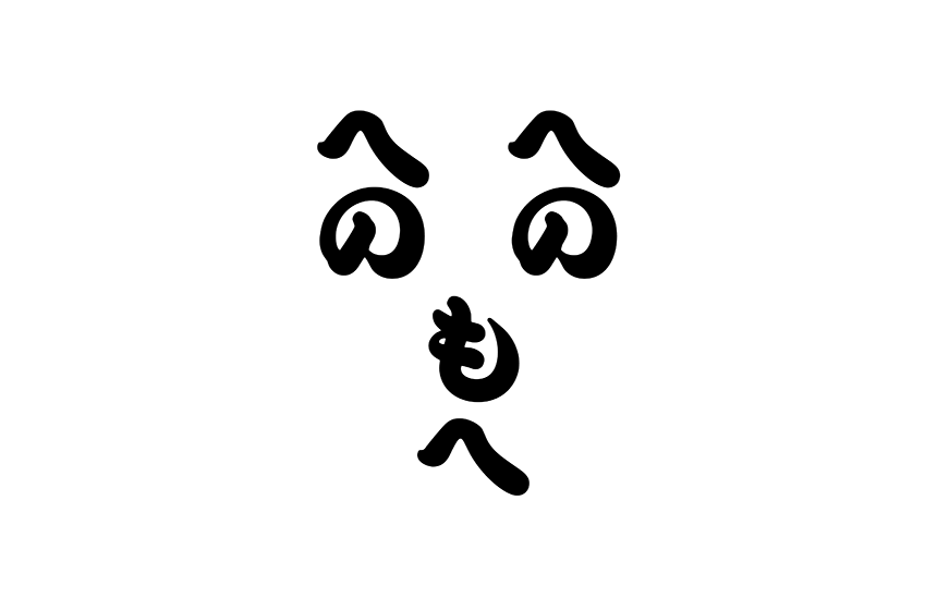
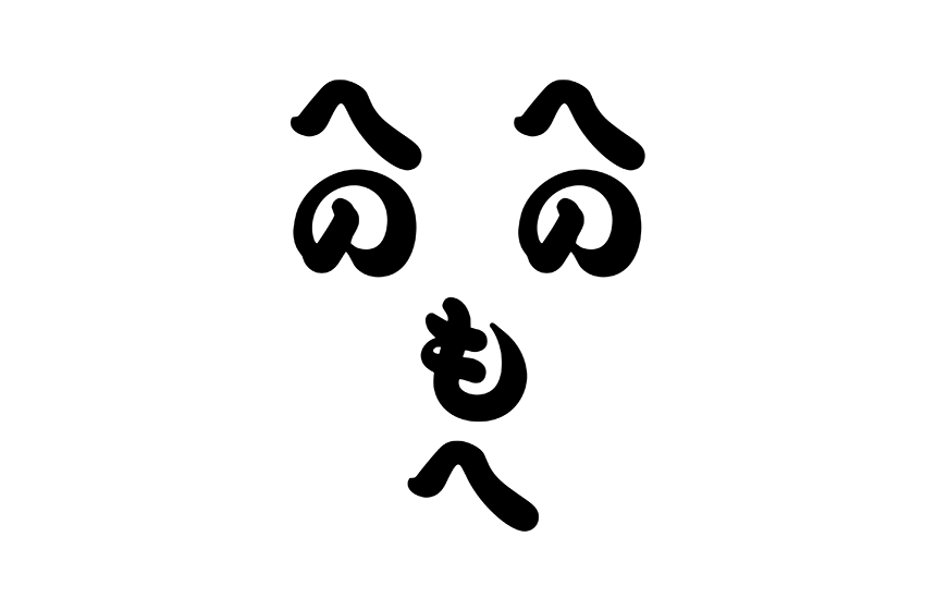
The fifth installment is the design font "Takarhythm."
It has rhythmic elements of rounded curves and triangles. Is there something that bothers him? The "hehemohe" handwriting looks like he's spitting out a "tch." I myself went through a rebellious phase in middle school, and there was a time when the smallest things would upset me. I hope he doesn't give up and keeps trying his best.
All five installments of Henohenomohe "letters" have now been completed. What did you think? I hope you were able to notice the different expressions that each font has.
(Contact: Moripass Department Otani)
This project is being handled by the official student members of the FONT SWITCH PROJECT, the "Moripass Club" students.