
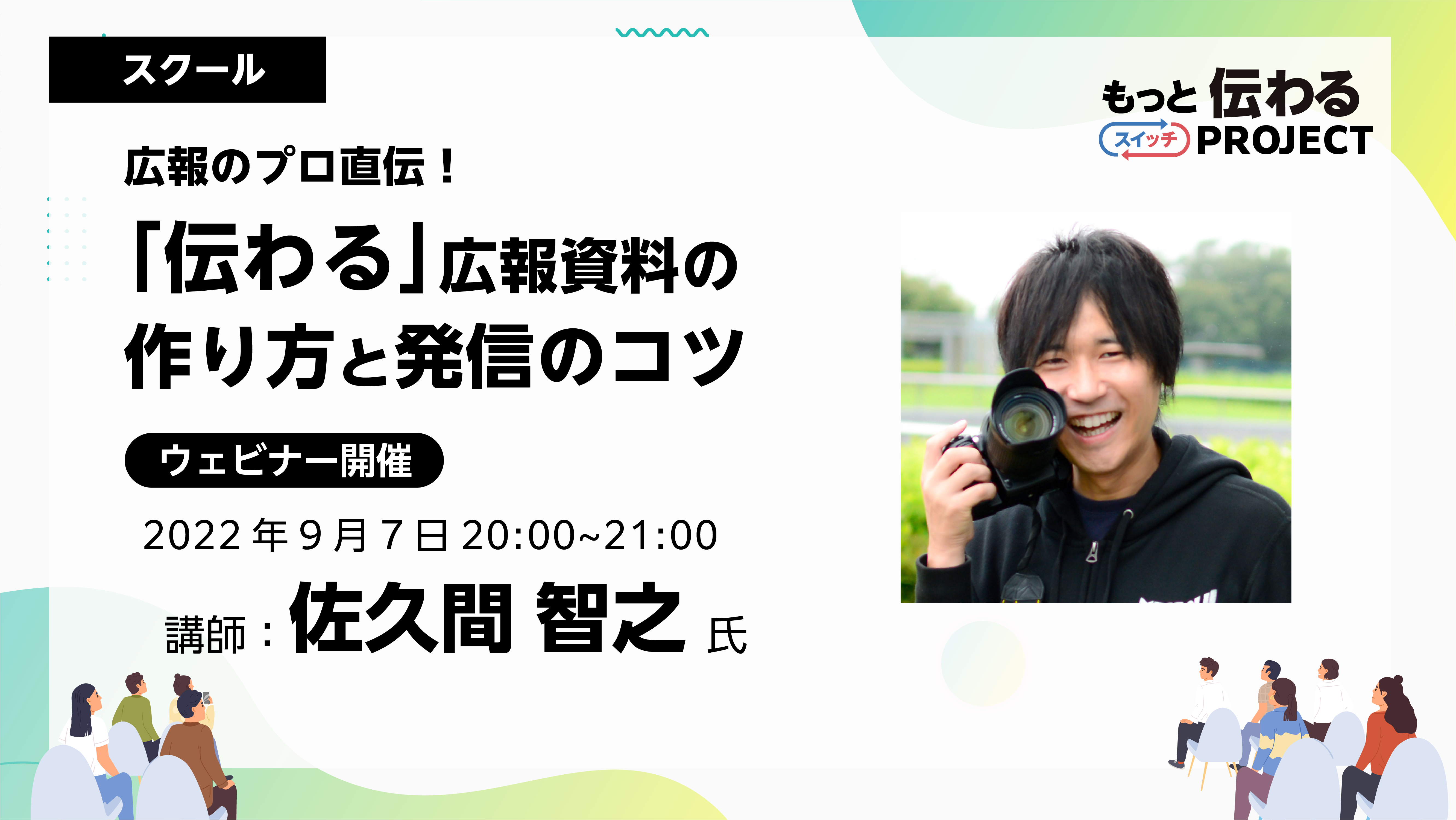
As a program aimed at improving skills in creating "communicative" PR materials, the school has been hosting a program in August with guest Sakuma Tomoyuki. This time, we will be introducing the "Direct from a PR professional! Tips for creating and disseminating PR materials for schools (2nd session)" will be reported.
If you would like to watch the archived video from the seminar, you can do so below.
*Registration is required to watch videos.
*In addition to watching the archived video, you can also download the materials and workshop materials from the day.
School Report

Guest Lecturer |Tomoyuki SakumaTomoyuki Sakuma
Representative Director of PRDESIGN JAPAN Co., Ltd. PR TIMES Evangelist Regional Strength Creation Advisor to the Ministry of Internal Affairs and Communications A former civil servant, he won the Prime Minister's Award at the National Public Relations Competition while still employed. He currently works as a public relations advisor for local governments and as a training instructor for public relations, PR, and design. He has written many books, including "Easy with Office! How to Create a 'One-Page Design' for Civil Servants" (Gakuyo Shobo).
Participant comments
Sakuma-san actually taught us the key points from everyone's homework, which made it very easy to understand!
I would like to use it to design school newsletters, school newsletters, and worksheets for my children. I have become more conscious of "who I am targeting" and "what I am doing."
It was an eye-opener for me to learn that you should add "decorations" to subtitles and third titles, not the main title. I tend to decorate the main title because I'm thinking about how to make it stand out...
This time too, there will be a lot of content, from homework clinics to demonstrations and teachings on design points.
If you're interested, please take a look at the archives.
Picking up issues and giving advice
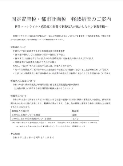
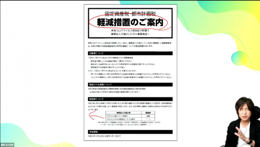
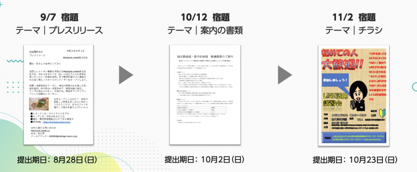
In the second school, the homework was to write an information document (to be written in Word) for residents. Participants were asked to rework the data in the homework into an information document that would be easier to understand and submit it.
From the many applications received, Sakuma will select some and provide comments and advice. At the end, Sakuma will edit the homework data and share a model.
This week's homework | Guidance text
Pick-up and lecture
Many of you have done your homework and posted your comments. Thank you!
There are two points to pay particular attention to in this report.
Align the table to the left
There are many cases where a table is inserted into a document, but the width of the table is shorter than the line length, resulting in strange white space. In such cases, adjusting the width to the line length will eliminate the sense of incongruity.
The recommended weight for headlines is Heavy
As we learned last time, many people used a "jump rate" that varied in speed. Furthermore, if you want to make the headline stand out even more, it is recommended to use larger fonts and a thicker weight, "Heavy." This "Information on Mitigation Measures" that we have highlighted is designed to draw attention!
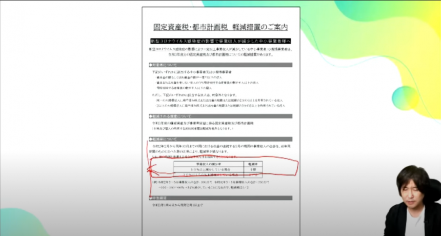
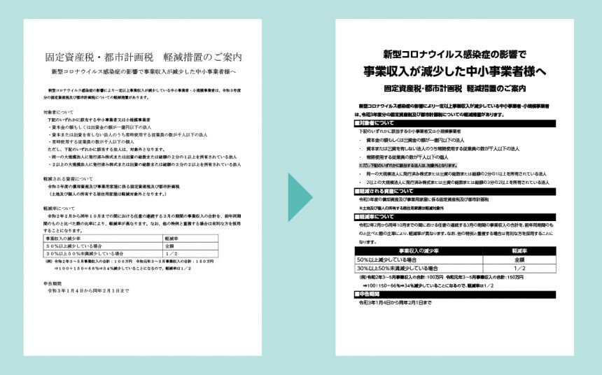
Sakuma demonstrates the remake
Remake Steps
- Arrange fonts
- Adjust the jump rate of the information you want to emphasize
- Set Style
- Adding contrast to the text
During the remake demonstration, questions from the assignment submitters were also answered, and they were taught how to save time by using the style function.
Just by remaking the font, the text became so easy to understand.
Points for the next homework assignment
We talked about how to create headlines in the previous press release, but this time we were given a more advanced technique (with a demonstration).
More Level Points
- Do not decorate the main title (decoration is subtitles)
- Shake up and down
- Fitting text into a square
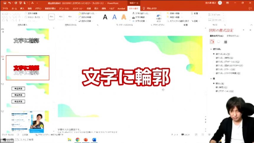
- Create a three-dimensional effect
Overlap instead of border!
As for techniques for creating a three-dimensional effect, we were taught how to create headlines that are easy to read and stand out by overlapping text, rather than using border functions that make the text difficult to read.
The hour flew by, but participants commented that they learned a lot.
School Announcements
Next time I'll create it using PowerPoint data.flyeris.
The flyers that public relations staff create internally should also be made to convey information that can be easily understood. The key is to separate information to be seen and information to be read, and to create a clear distinction!
All three sessions of the school have prepared content that is often used in public relations activities! By challenging yourself with the homework, you will be able to learn more practically!
*Registration is required to watch videos.
*In addition to watching the archived video, you can also download the materials and workshop materials from the day.
If you want to use UD fonts, which Sakuma recommended in the seminar, easily in Office applications,We recommend MORISAWA BIZ+. For details,Here
Also,As a company, local government, organization, or school organizationIf you are considering using UD fonts, please feel free to ask us any questions below.
Sakuma's social media accounts are packed with information that only a public relations professional can provide. Please take a look at them along with his books and website.
PRDESIGN JAPAN Co., Ltd.– Changing Japan through public relations and design.