

Introducing each of our wonderful members one by one [Moripass Club Member Introduction].
This time, Moripass Club advisor Suda will be sharing the story!
This time, we'll focus on the Moripass members!
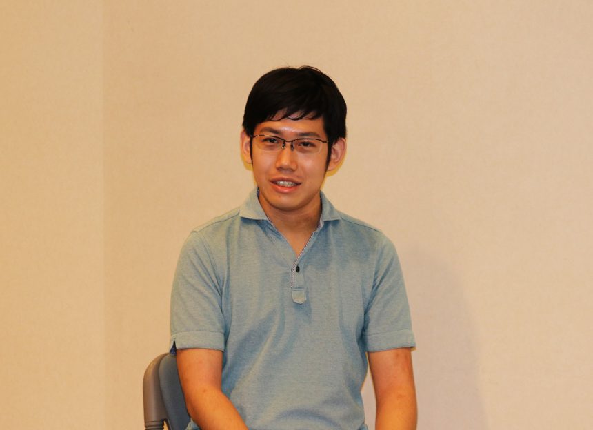
Mr. Yuki Ichihashi
Tokyo Metropolitan University Graduate School, Faculty of System Design, Industrial Art Department, 1st year
My favorite font is "Suzumushi."
We asked Ichihashi to create a piece based on this theme!
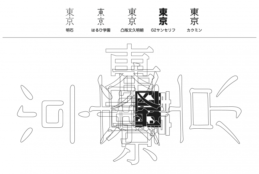
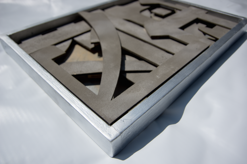
Tokyo × Typography
concept
We envisioned "Tokyo" as a place where new value is born as people and things gather and interact, and asked the designer to use the motif of a junction on the Shuto Expressway where multiple lanes intersect.
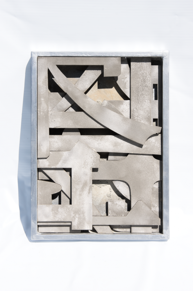
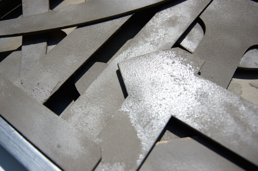
For this object, the shape of the letters, with various curves and straight lines intersecting, is likened to a road, and the letters "Tokyo" were cut out using five different typefaces and layered on top of each other to create depth. By enlarging a portion of the letter, the artist aims to draw attention to the shape, rather than making it directly recognizable as the word "Tokyo."
Cement was used for the texture to represent the texture of the road, with both uniform and cracked areas.
The pursuit of texture
When asked what was difficult about the production, Ichihashi replied, "The cement didn't adhere to the wood very well, so it took a while to find a way to fix it." In the end, he managed to make it adhere by spraying the cement onto a damp surface and heating it in the microwave. All that hard work paid off, as the result is a solid, finished piece!
Pay attention to the differences in the details of the fonts!
This was the first time he had created a piece with letters as a motif, but while creating the object, he began to notice the details of each part of the various typefaces of letters, rather than just the overall atmosphere he had previously perceived.
The impression you get when reading the letters is quite different from the impression you get when you enlarge each letter and look at their form, and I realized that the atmosphere of the typeface is created by the subtleties of the curves that you can't see unless you look closely.
Ichihashi noticed that the overall impression of the typeface was different from the impression he got when he enlarged it and focused on the elements. This was the moment when the font's sensitivity was truly "ON"!
Various "Tokyo", various "fonts"
When choosing typefaces, we asked the participants to choose five typefaces based on various images of Tokyo, such as "Akashi" for high culture, "Haruhi Gakuen" for subculture, "Toppan Bunkyu Mincho" for tradition, "G2 Sans Serif" for modernity, and "Kakumin" for systematic...
The typefaces chosen were from as many different contexts as possible, including Mincho, Gothic, and calligraphy, and they portray the charm of Tokyo, where diverse values overlap and new values are born. I think it's a cool piece that will make you realize the new coolness of typefaces that you're used to seeing!
from now on
"In my graduate school major, I don't often have the opportunity to create pure, non-functional works, so it was a fresh experience for me," he said about his creative activities in the Moripass club.
I believe that being able to distinguish between the impression of a typeface as a character and the impression of its pure form will enable me to convey my intentions more strongly, so I would like to keep this in mind when creating designs.
With words like these, Ichihashi is sure to show off his design skills in the free paper team! His role as advisor is also looking forward to it!