

Font Stamp: Kenichi Suzuki's Case
My project involves creating stamps using Morisawa typefaces, similar to the ones I normally use on social media and communication apps. By redesigning frequently used words and stamps using typefaces, I hope to be able to convey even the most subtle nuances!
This time, we asked Kenichi Suzuki from Musashino Art University to choose the font and words!
Below is the creator's comment.
●What I paid attention to and what I felt when making the stamps
I created these stamps to be conversation topics.
●Reason for using that typeface
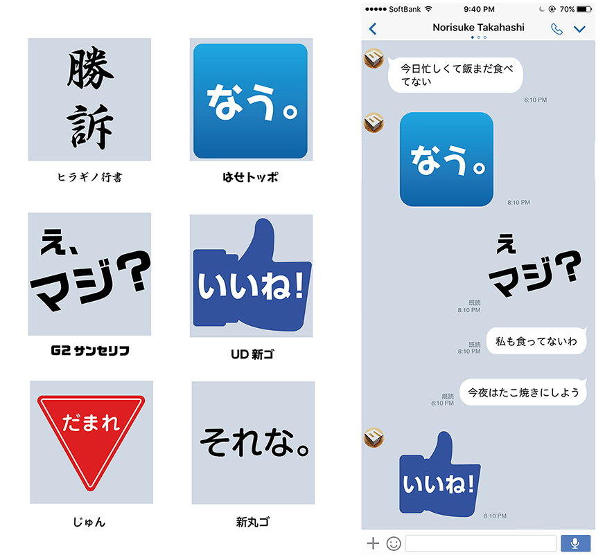
"Victory" was the most powerful character.
Because "Shut up" looked very similar to the "Stop" sign
●If the stamp you created actually existed, would you want to use it?
Honestly, I want to use it.
●Was Morisawa's typeface useful in conveying the impression of your words?
The MORISAWA PASSPORT Academic Edition has a large number of fonts and a variety of weights, so I felt I could use it without any problems.
The "Victory" stamp seems to fully utilize the strengths of the powerful typeface.
It's easy to use in everyday conversations, and I want one too!
The "Shut up" stamp is a unique design inspired by road signs we see every day. I really like this one as it looks like it would be easy to use during conversations. The design is also interesting, so I think the recipient would be surprised. In terms of the design, I would like to choose the standard "Maru Gothic" font. "Jun" fits in nicely, and there is no sense of unease when looking at it, so I like the use of this font!
(Person in charge: Moripass Department Inada)
This project is being handled by the official student members of the FONT SWITCH PROJECT, the "Moripass Club" students.