
Have you ever had trouble getting your point across in a presentation or project materials? In this series of columns, Toyomane, known as the "PowerPoint comedian" who shares know-how on Twitter for quickly getting your point across and has amassed over 90,000 followers, will share tips on creating PowerPoint materials and the relationship between fonts.
Creating documents is time-consuming
Do you create materials? Business meetings, reports, briefings... Materials created using tools like PowerPoint are necessary in a variety of business situations. However, creating easy-to-understand and easy-to-read materials can be quite a challenge.
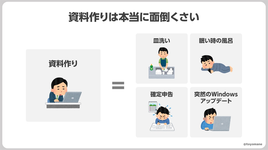
"Making materials takes so much time and I'm not good at it because it never works out..." I'm sure there are many people who think this way. I totally understand that. Making materials is really a pain, isn't it?
However, those of you who are working hard to make your documents easier to read may be focusing your efforts in the wrong direction. "What kind of shapes should I use?" "What kind of layout should I use?" "What kind of illustrations should I insert?" Aren't you preoccupied with these things?
Of course, these points are important, but there is one thing you should think about first: the characters.
The document is 60% text
Take a moment to stop using PowerPoint and take a look at the document you're creating. Isn't a significant portion of it made up of text? It's a surprising blind spot, but documents actually contain quite a lot of text. Roughly speaking, you can assume that about 60% of a document is made up of text.
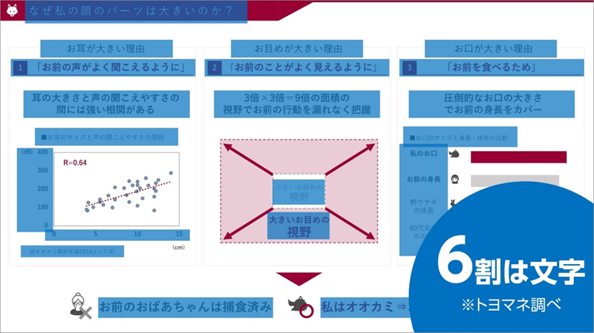
This means that "if the text on a document is easy to read, it will be about 60% easier to see." 60% is a significant percentage. Before thinking about the shape and layout of the graphics, try making the text easy to read first.
Font selection is really important
So, what can you do to make text easier to read? The first step is to choose the right font. When choosing fonts for your documents, do you just pick them randomly without giving them much thought?
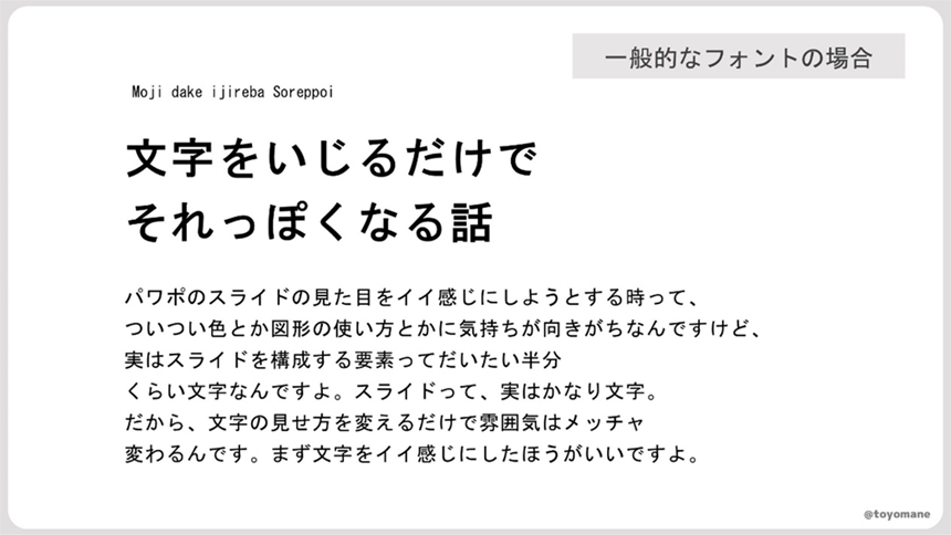
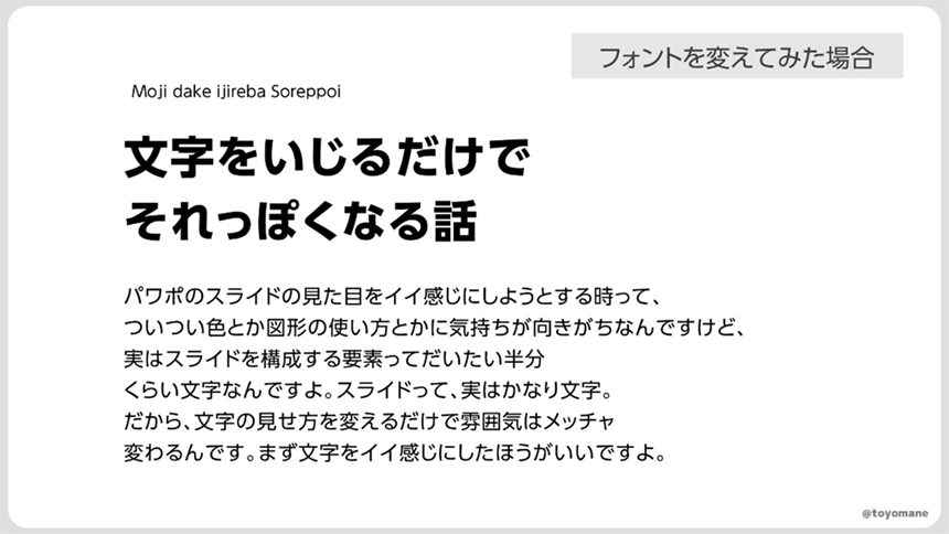
Just changing the font can make a big difference in how easy it is to read your documents. Take a look at this, for example. By changing the font, it becomes clearer and easier to read.
Here, I will briefly explain two points to keep in mind when choosing a font for your documents.
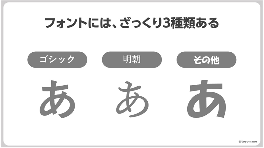
The first thing to do is to choose a Gothic font. To begin with, fonts available in the world are roughly categorized into three types: Gothic, Mincho, and other.
For documents that are often printed small or projected and viewed from a distance, Gothic fonts are suitable as they are less quirky and easier to read.
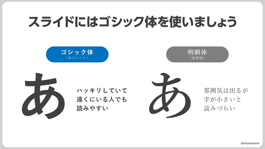
The second thing is to choose something that has a clear distinction between bold and thin type. As we will explain in more detail in the next article, "contrast" is very important to make the text easy to read. Choose something that has multiple thicknesses (weights) available and that makes it easy to create contrast.
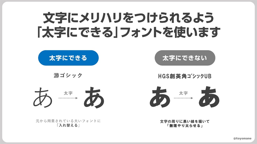
Among the fonts that come standard on Windows PCs, we recommend Yu Gothic, Meiryo, and BIZ UDP Gothic.
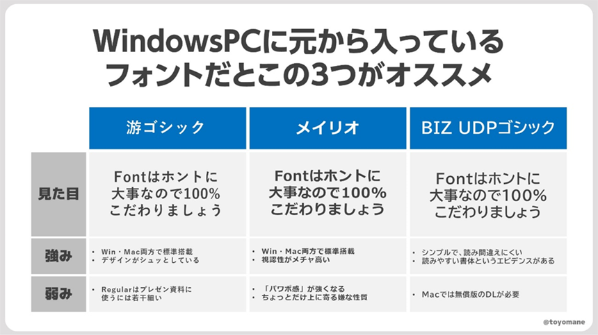
However, each of these fonts has its weaknesses. Yu Gothic's standard Regular thickness is a bit thin, which can make it difficult to read in presentations. Also, due to the characteristics of Meiryo, when writing on shapes, the letters tend to lean slightly upward. Of course, there are solutions, and all are very easy to use, but if you're particular about fonts and want to take things to the next level, you may want to consider using other fonts, including paid or free fonts.
For those who want to take their fonts to the next level
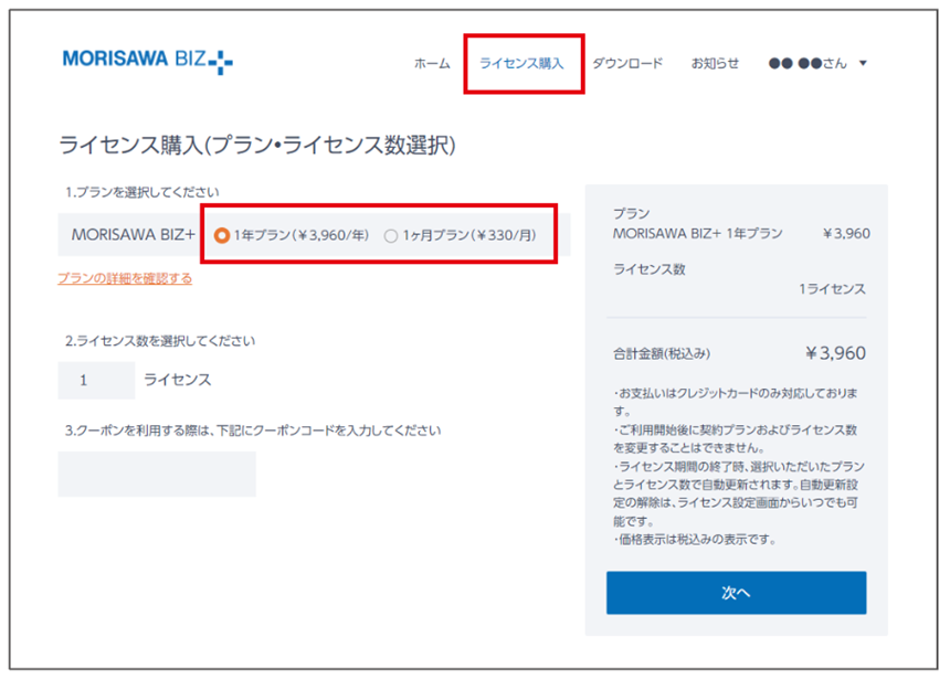
Morisawa Inc. offers a subscription service called "MORISAWA BIZ+" is now available. With a lineup of fonts in a variety of weights and types, taking universal design into consideration, your PowerPoint presentations will be significantly easier to read!
Try it out for just 330 yen per month.
I changed the font. It got the message across. | "MORISAWA BIZ+"Herefrom
It's also good to follow the local customs and let off some steam elsewhere.
Some of you may be worried, saying, "I want to use a more stylish font, but my company/laboratory specifies this font..." In such cases, it's best to "follow the local customs."
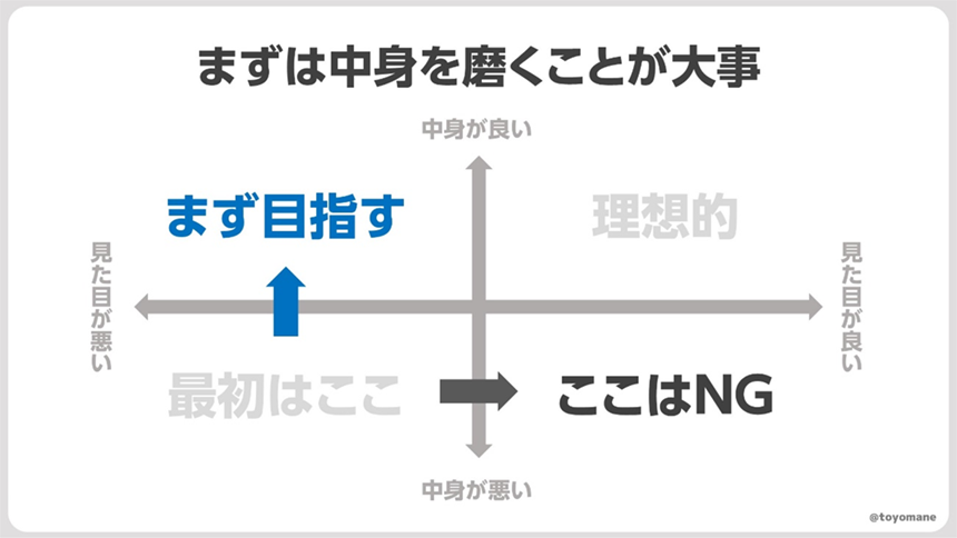
As I've mentioned in detail so far about the importance of fonts, fonts are seriously important. However, when creating documents as part of an organization, it is often best to create documents in accordance with the organization's guidelines. Furthermore, the most important thing about documents is the content. No matter how beautiful the appearance, it is meaningless if the content is of low quality.
If you're required to use ugly, hard-to-read fonts, why not compete with the content? Why not create stylish, easy-to-read slides in your private time and share them? If you post them on Twitter, someone might notice. So, let's tweet PowerPoint!

Toyomane (Toyomane, blue background)
Born in Tokyo in 1994. Graduated from the Faculty of Engineering at the University of Tokyo. While working at Suntory, where he is in charge of CRM and advertising for the mail-order business, he is also involved in the creation of PowerPoint slides as a hobby, which are used on Twitter (@toyomane) has been met with a great response. With the motto "It's silly, but useful," he shares useful know-how for creating slides, as well as less useful images. His latest book is "PowerPoint Techniques to Communicate in Seconds: Tips for Creating Slides that Get Likes at Work and on Social Media."
Event Announcement
The series of seminar events that began on June 29th and will run until November,More Communicative Switch Project planned by font manufacturer Morisawa" will feature a variety of guests discussing materials that are more effective at communicating information, depending on the means used, such as presentations, public relations, and flyers.
If you are having trouble creating presentation materials, we recommend a school that features presentation professional Keiichiro Takahashi as a guest.

For those who want to focus on fonts
In the illustration in Toyomane's article, UD fonts for business use are"MORISAWA BIZ+"We are using the paid font "BIZ UDP Shin Go" included in the website. If you would like to use the same font, you can use it with the business UD font subscription "MORISAWA BIZ+" for 330 yen per month.

You can download free fonts or purchase paid fonts.Free Membership RegistrationClick the button below↓
Paid fonts can be purchased by selecting a plan from the "Purchase License" tab after registering as a member.